Master bath reveal
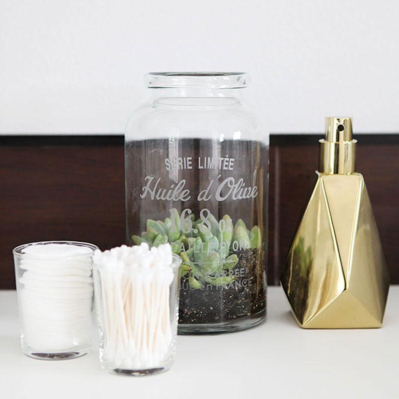
The wait is over. Our master bathroom remodel is completed. And we just passed our final inspection this morning! Woot!
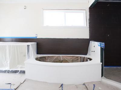
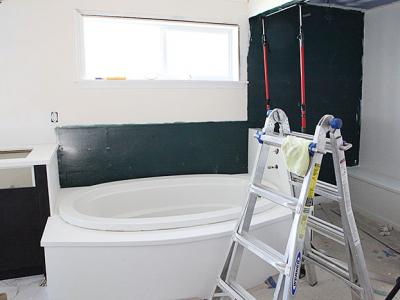
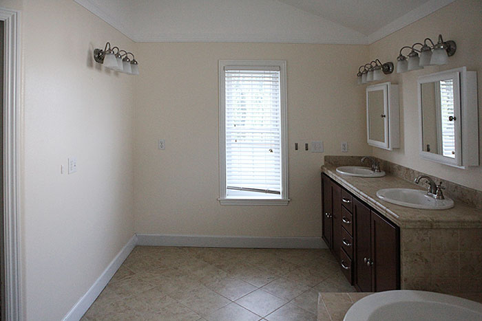
Here is what the bathroom looked like before.
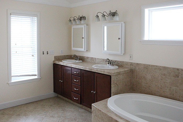
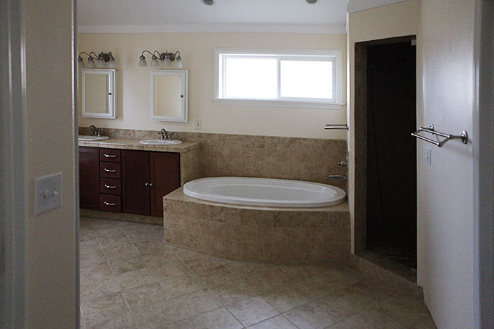
We kept the existing layout and reused the tub and several of the fixtures and we worked with the existing floor, but still gave it a completely new look.
Check out what it looks like now!
We made a new vanity out of IKEA kitchen cabinets and drawers. And then we had the vanity top, tub deck and surround and most of the shower covered in honed, white cultured marble.
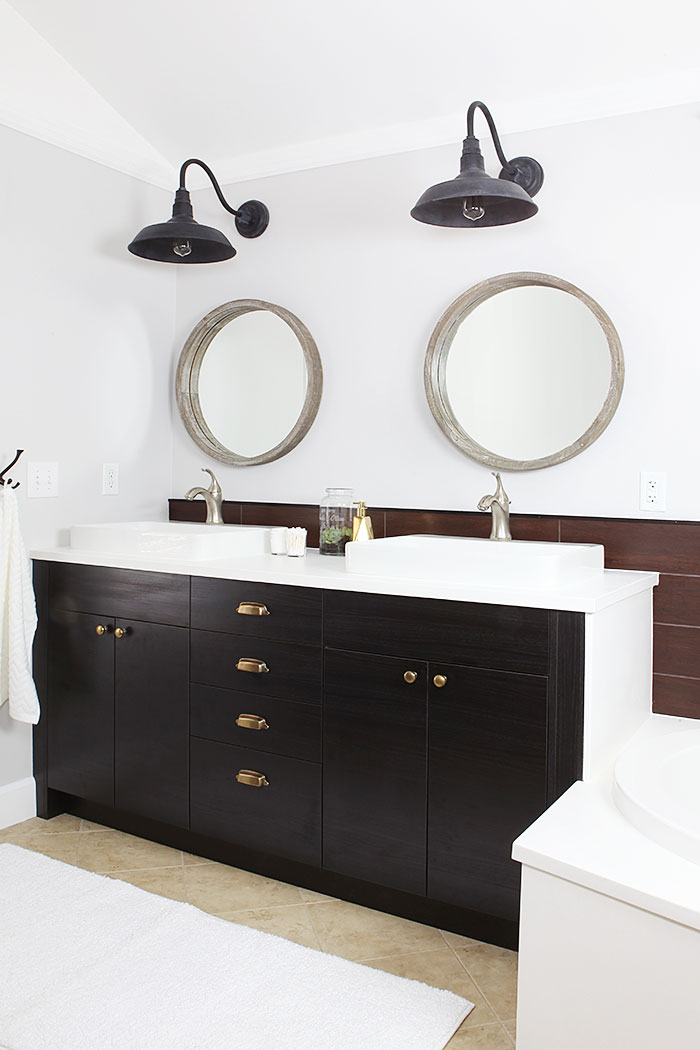
We got new sinks and faucets for the vanity.
We had a dark brown wooden looking tile installed along all of the back wall to stand up to and possibly take the attention off the floor a bit.
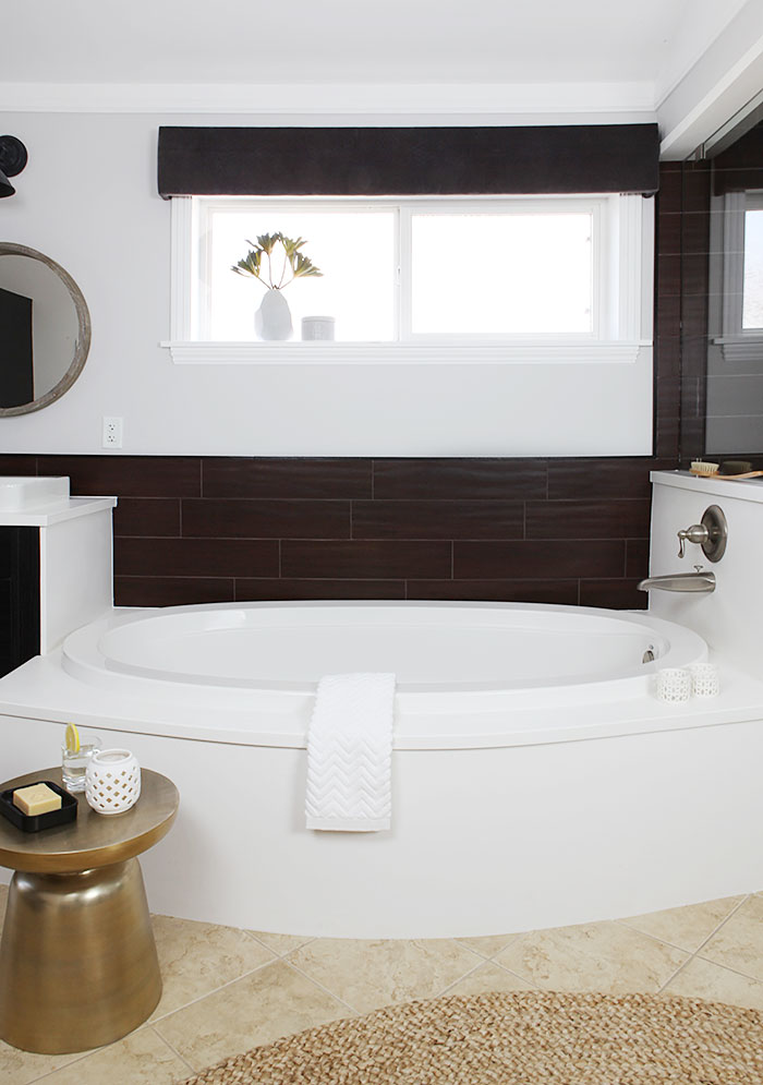
Another strategy for the floor: cover it up some. I used a 6 ft braided rug in a tone on tone color to cover a large portion of the floor. Using a natural material in almost the same color as the floor, I feel, makes the floor look more intentional rather than 'just' being covered up. If that makes any sense.
Here is the view from the master bedroom before:
And after:
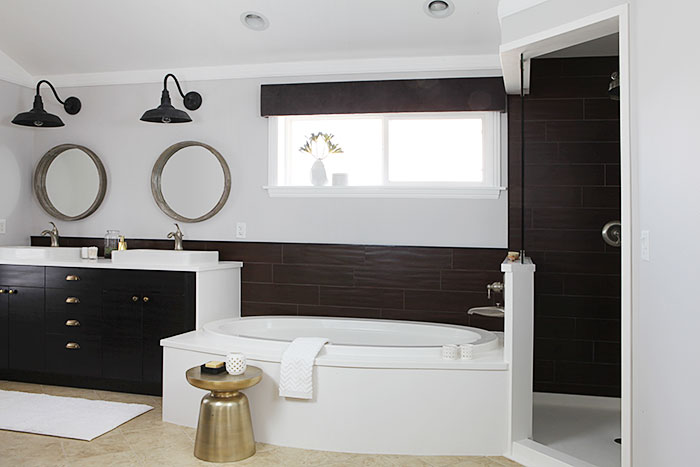
We had a lot of white cultured marble installed to brighten up this bathroom. Including a solid marble pan in the shower.
We added brass hardware to the cabinets. I bought knobs and bin pulls and aged them instantly like this.
The shower before was a dark dungeon. The light and fan was one unit and so loud we always showered in the dark.
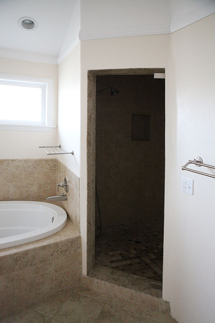
And now:
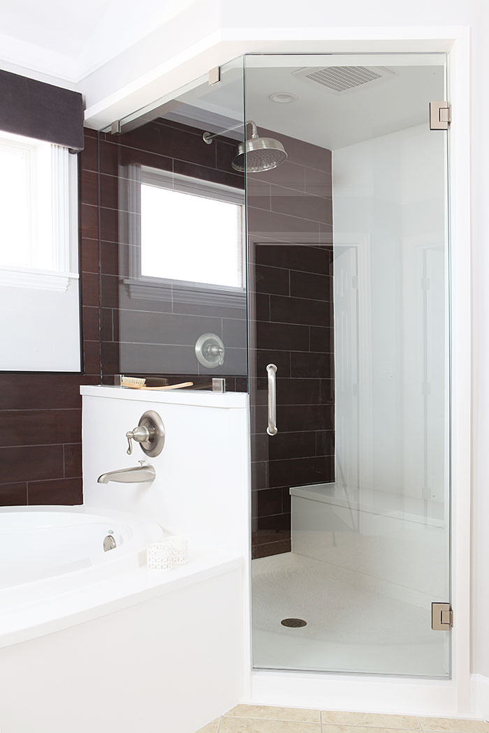
We installed a super quiet - 0.5 sones - fan and two pot lights in the shower. And replaced part of the wall with glass. All making for a lighter and quieter shower experience.
We added a rain shower head - moved to the adjacent wall to make way for the new glass wall, and reused the valves for the faucet. We also reused the original shower head on the opposite wall - seen below. We reused all the plumbing for the tub, but we switched out the inner brass valves so everything works just like new.
We reconfigured the bench as well. Before we had a small triangular bench in the corner, but the shower was plenty big for a bench all along the back wall. The shampoo niche, we moved to the opposite wall, out of sight. Who wants to look a shampoo bottles?
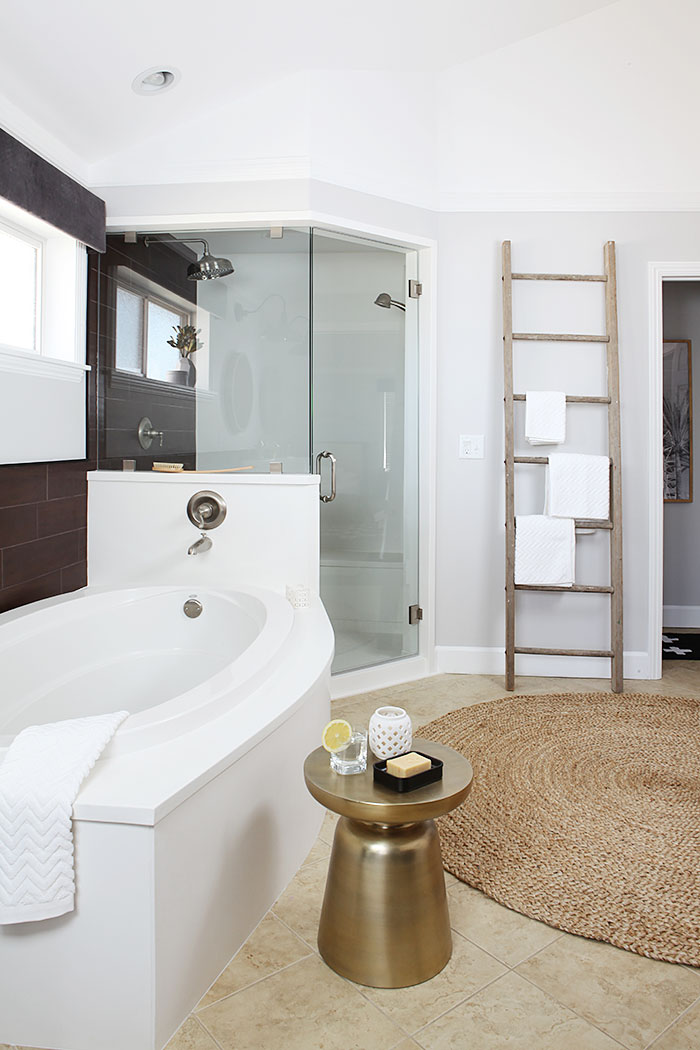
This is me using a vintage ladder as a towel holder. I will let you know how long that lasts. Or if I install one of these instead and move the ladder somewhere else. It does look great though. And ties in with the mirrors.
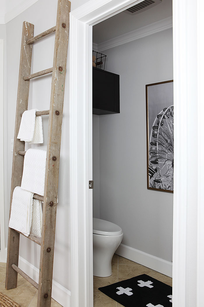
You can see all of the reveal of the toilet room here, where you can also download the Ferris wheel print.
We filled up this empty wall on the left - before:
With a tower / bench situation that Frank and I made out of more IKEA cabinets.
After:
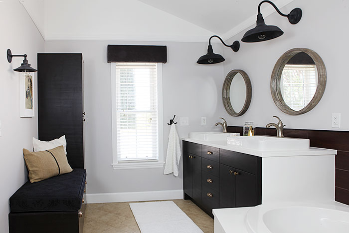
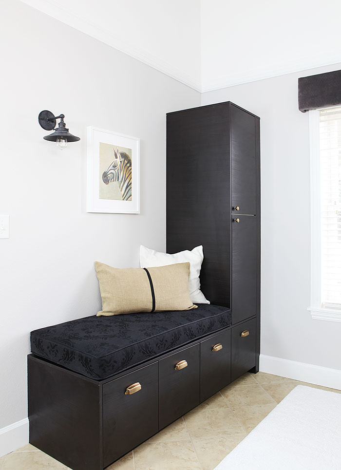
I love this new seating bench. We placed the bin pulls on the lower fronts so they look more like drawers. The brass tones and the pillow further ties into the floor, again making the floor look intentional. Honestly like how the floor is adding warmth to the other neutrals now.
The tower has an outlet inside for recharging toothbrushes out of sight.
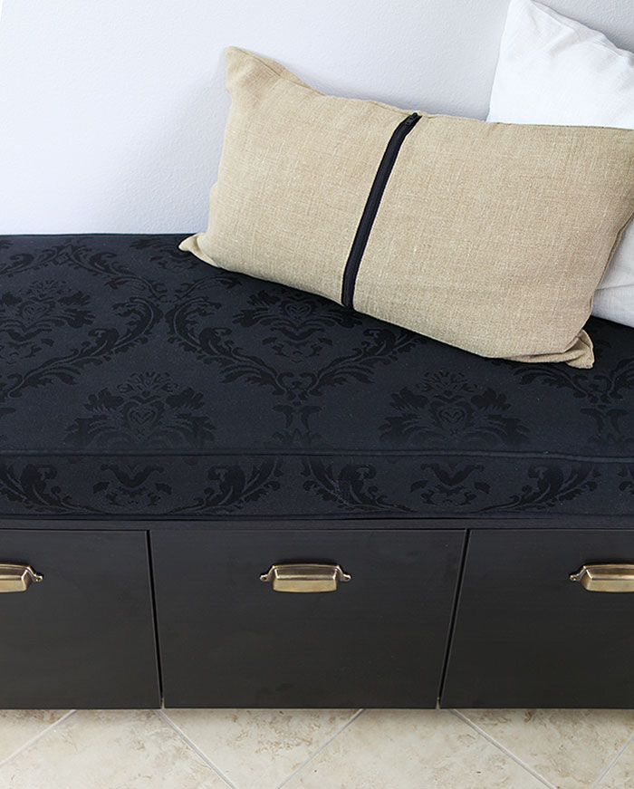
Also, meet my new favorite fabric (I think this is it) that I got in Denmark. It looks sort of like horse hair fabric, but it is cotton and polyester. I just love it. I want to upholster all the things with this fabric.
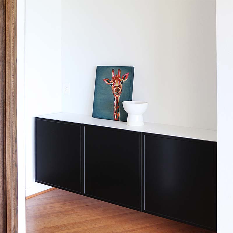
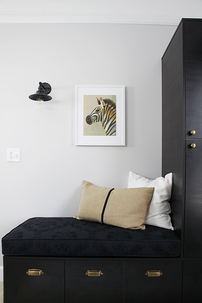
Oh and are you missing the abstract painting I made last week for this space. Sorry. It was there for quite a while, then I was sitting in the living room the evening before taking these photos and looked at my zebra and just thought: That is just the perfect picture for that space. So they switched places.
I once read in a book that is is OK to change your mind.
I will be back with a post with links to all the sources.
Here are the links to the whole master bath renovation:
Turning to the Master bathroom - before pictures and mood board.
Planning a master bathroom remodel
Demoing the master bathroom
Master bath - plumbing, electrical and new construction
How to: age brass hardware instantly
Master bath progress: Shortened built-in IKEA seating bench and cabinet tower
Progress in the toilet room - a Bondo experiment and new paint and cabinet
Master bath pan installation and 9 rectangular sink options
Master bath - Hardie backerboard installed - how we did it
Ferris wheel print and toilet room reveal
Master bath update - marble installation
Master bath - tile installation
All our room renovations can be found under Rooms in the menu.
Share
Here is what the bathroom looked like before.

We kept the existing layout and reused the tub and several of the fixtures and we worked with the existing floor, but still gave it a completely new look.
Check out what it looks like now!
We made a new vanity out of IKEA kitchen cabinets and drawers. And then we had the vanity top, tub deck and surround and most of the shower covered in honed, white cultured marble.

We got new sinks and faucets for the vanity.
We had a dark brown wooden looking tile installed along all of the back wall to stand up to and possibly take the attention off the floor a bit.

Another strategy for the floor: cover it up some. I used a 6 ft braided rug in a tone on tone color to cover a large portion of the floor. Using a natural material in almost the same color as the floor, I feel, makes the floor look more intentional rather than 'just' being covered up. If that makes any sense.
Here is the view from the master bedroom before:

And after:

We had a lot of white cultured marble installed to brighten up this bathroom. Including a solid marble pan in the shower.
We added brass hardware to the cabinets. I bought knobs and bin pulls and aged them instantly like this.
The shower before was a dark dungeon. The light and fan was one unit and so loud we always showered in the dark.

And now:

We installed a super quiet - 0.5 sones - fan and two pot lights in the shower. And replaced part of the wall with glass. All making for a lighter and quieter shower experience.
We added a rain shower head - moved to the adjacent wall to make way for the new glass wall, and reused the valves for the faucet. We also reused the original shower head on the opposite wall - seen below. We reused all the plumbing for the tub, but we switched out the inner brass valves so everything works just like new.
We reconfigured the bench as well. Before we had a small triangular bench in the corner, but the shower was plenty big for a bench all along the back wall. The shampoo niche, we moved to the opposite wall, out of sight. Who wants to look a shampoo bottles?

This is me using a vintage ladder as a towel holder. I will let you know how long that lasts. Or if I install one of these instead and move the ladder somewhere else. It does look great though. And ties in with the mirrors.

You can see all of the reveal of the toilet room here, where you can also download the Ferris wheel print.
We filled up this empty wall on the left - before:

With a tower / bench situation that Frank and I made out of more IKEA cabinets.
After:


I love this new seating bench. We placed the bin pulls on the lower fronts so they look more like drawers. The brass tones and the pillow further ties into the floor, again making the floor look intentional. Honestly like how the floor is adding warmth to the other neutrals now.
The tower has an outlet inside for recharging toothbrushes out of sight.
Also, meet my new favorite fabric (I think this is it) that I got in Denmark. It looks sort of like horse hair fabric, but it is cotton and polyester. I just love it. I want to upholster all the things with this fabric.

Oh and are you missing the abstract painting I made last week for this space. Sorry. It was there for quite a while, then I was sitting in the living room the evening before taking these photos and looked at my zebra and just thought: That is just the perfect picture for that space. So they switched places.
I once read in a book that is is OK to change your mind.

I will be back with a post with links to all the sources.
Here are the links to the whole master bath renovation:
Turning to the Master bathroom - before pictures and mood board.
Planning a master bathroom remodel
Demoing the master bathroom
Master bath - plumbing, electrical and new construction
How to: age brass hardware instantly
Master bath progress: Shortened built-in IKEA seating bench and cabinet tower
Progress in the toilet room - a Bondo experiment and new paint and cabinet
Master bath pan installation and 9 rectangular sink options
Master bath - Hardie backerboard installed - how we did it
Ferris wheel print and toilet room reveal
Master bath update - marble installation
Master bath - tile installation
All our room renovations can be found under Rooms in the menu.
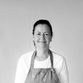
About Katja Kromann
I am a Danish American decorating life in Seattle. I love all things design and DIY.
I can’t think of anything more fun than coming up with project, making it, photographing it and sharing it with you on my websites.
Since 2018 I have been making Ceramics, nearly full time.
AHomeForCeramics.com AHomeForDesign.com AHomeForCrafts.com AHomeForFood.com My Portfolio
