Shift Ctrl Art has a new look: logo, website, blog card and more
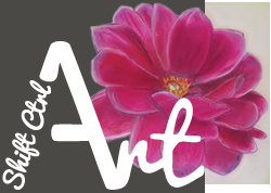
With almost 10 months of consistently posting at least three times a week on my little blog here, I thought it was time that I treated it to a real logo.
I have had the rough design in my mind for quite a while. I knew I wanted my logo to be more square so I could fit the slide show next to the logo instead over over it. I knew I wanted the "Shift Ctrl" to move up the "A" in art. I wanted to keep my logo white and I wanted to keep the flower I drew.
I extracted the flower from this drawing of mine:
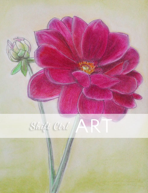
I drew this flower back in the fall of 2011 one Saturday morning. The flowers were sitting in my window sill in my kitchen and I thought they were so pretty.
I made a new design for the site as well. It looked like this yesterday (Although this was after I took down the slideshow).
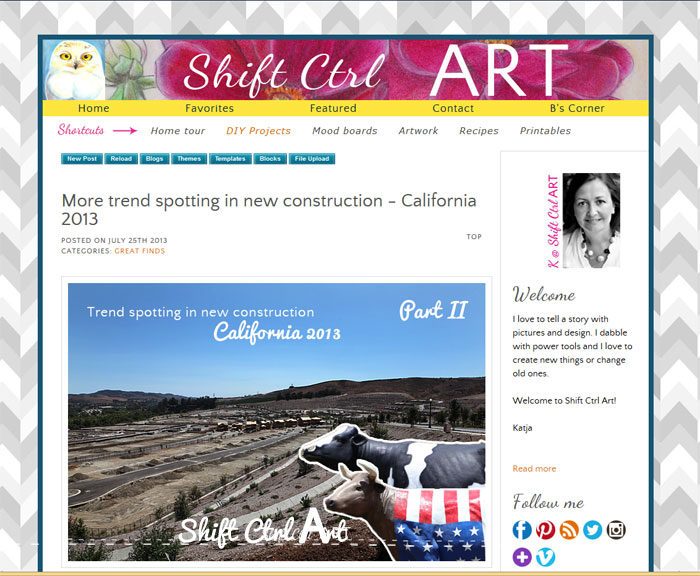
Now it looks like this:
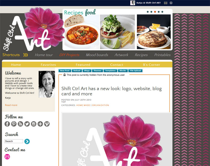
I wanted to try something new with the background. I made those ombre pink arrows. You know I'm on an arrow kick lately, right? No "all over" background for this blog. Nope... trying out just this stripe of ombre arrows.
I also made a new blog card because I am almost out of the first one I made.
My new one looks like this.
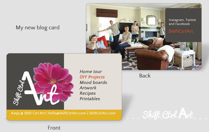
I just got a shipping notice for it today and it should be here early next week.
I tried something new (to me): Spot UV printing. Some of the card will be shiny while other parts will be matte. On the back the gray rounded square with text will be shiny, on the front, the text including the white logo, but not the flower, will be shiny.
For the background, I used this image that I also used in my post about my favorite room and how I made that image.
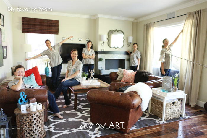
I just think that is such a funny picture.
Crossing this project off my to-do list
Psst - if something looks weird you can try hitting ctrl F5 on a pc or Command R on a mac. If it still looks weird, please let me know.
Have you crossed any big things off your to-do list lately?
About Katja Kromann
I am a Danish American decorating life in Seattle. I love all things design and DIY.
I can’t think of anything more fun than coming up with project, making it, photographing it and sharing it with you on my websites.
Since 2018 I have been making Ceramics, nearly full time.
AHomeForCeramics.com AHomeForDesign.com AHomeForCrafts.com AHomeForFood.com My Portfolio
Categories
Shift Ctrl Art has a new look: logo, website, blog card and more is posted in the category Organization
