Memory lane - the house we built in the 90s - 40 photos
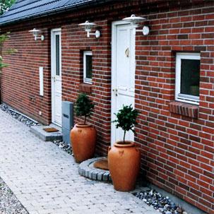
It's time for a trip down memory lane. All the way back to 1997 when dh and I built a house together in Denmark.
We used a building company for all the difficult stuff.
They
Made the foundation.
Set up all the downstairs walls.
Poured a level sub floor.
Did all the mason work incl. insulation on down stairs walls.
Put on the roof.
Installed the windows and exterior doors.
Did all electrical, plumbing and tiling.
Delivered all our materials.
We also had some help.
My parents came out 4 weekends and helped with the insulation upstairs (my dad) and with painting windows and filling walls (my mom).
My best friend's boyfriend and two of his friends came out one afternoon and helped us lift up the stairs - picture later - so it could be installed.
We hired someone to help with finishing the drywall around the sky lights. And to mud the drywall upstairs.
We hired a landscaper to lay all the outside pavers.
Dh and I did the rest:
Insulated the entire second floor.
Put up drywall - 12 ft or so to the tip of the slanted celings.
Put down sub floors upstairs.
Put down hardwood floors.
Put in all interior doors and installed hardware.
Installed all the tongue and groove ceilings down stairs.
Installed all the cabinetry in the kitchen, mudroom, bathrooms and guest bedroom.
Walls prepped and painted.
It took us about 4 months of working every day after work - getting off at 5pm - go to the house and work until 11pm. And every weekend from 8am - 11pm.
We sold the house in 2000 after living there about 2 years just before moving to the States.
It was a very fun project and we loved doing it.
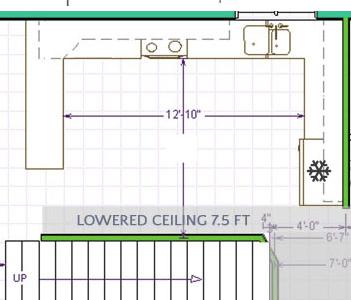
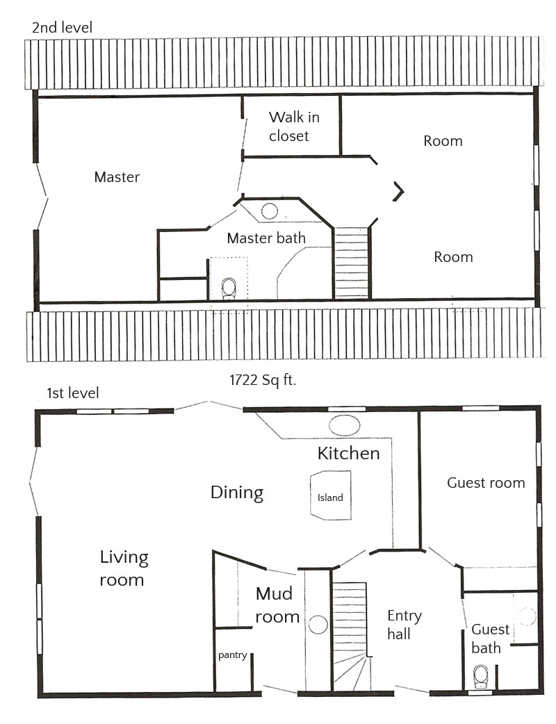
Let's take a look. First up the floor plan.
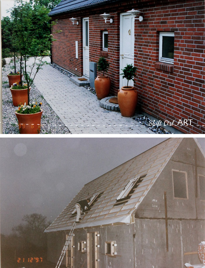
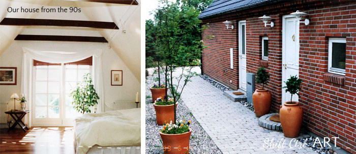
On the lower picture you see the walls that were pre-fabbed at a factory. They were put up in only one day. The brick is attached to the outside with those metal wires you see in the concrete walls. Insulation was tucked in between.
You know how some people will say: I don't have any photos of that, because that was before I started blogging? Yeah... that's not me. I have been a blogger at heart even before it was a thing, I'm proud to say. I will save you the slew of pictures I have and only show this small collection that I have carefully curated. These top 40 pictures, focusing mostly of the "afters". The only room I don't have a picture of is the mud room. Boohoo. It had white cabinets with a gray counter top with a sink on the left and on the right it had a walk-in pantry and a built in bench/low table top for folding with a clothes lines arrangement above it and the laundry basket underneath it.
These pictures were all taken with our manual slr camera andI started scanning them in but that was too boring I took pictures of them in groups with my digital camera.
The foundation.
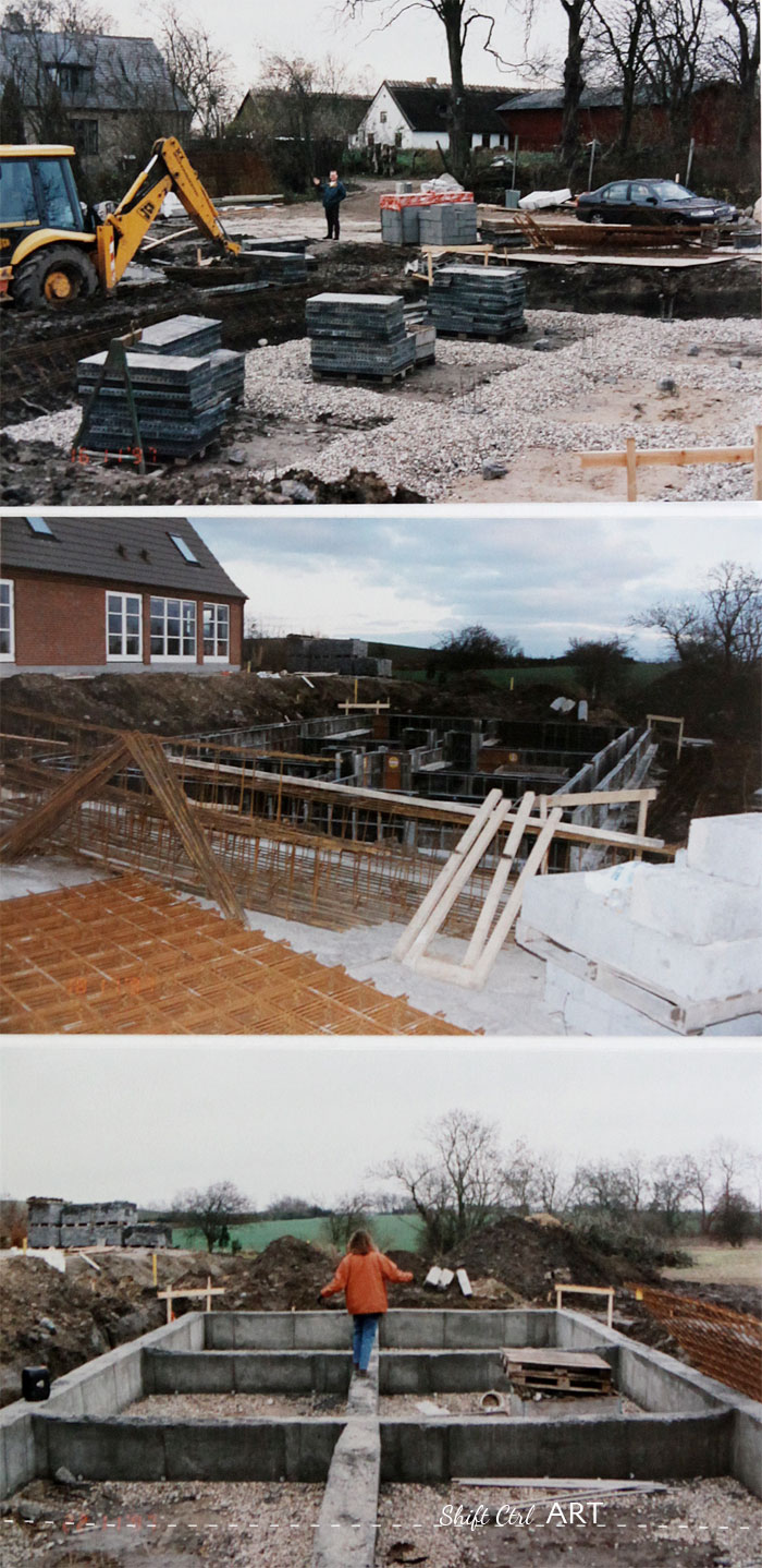
Dh waving in the background. Foundation walls delivered. Next picture: foundation walls up, third picture: me balancing on the foundation.
The exterior.
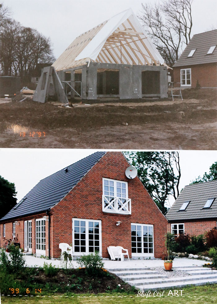
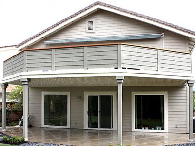
Here is the house as seen from the back yard. We had french doors upstairs in the Master bedroom. Those white crosses are a tell tale sign of the 90s.
The view.
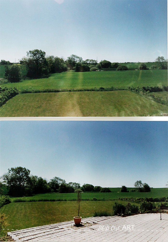
Here is the view. Our lot ended down by the low row of plants. Behind there is a farmers field. In the far back where the threes and bushes are, was a little water hole/pond. I loved that view!
The kitchen:
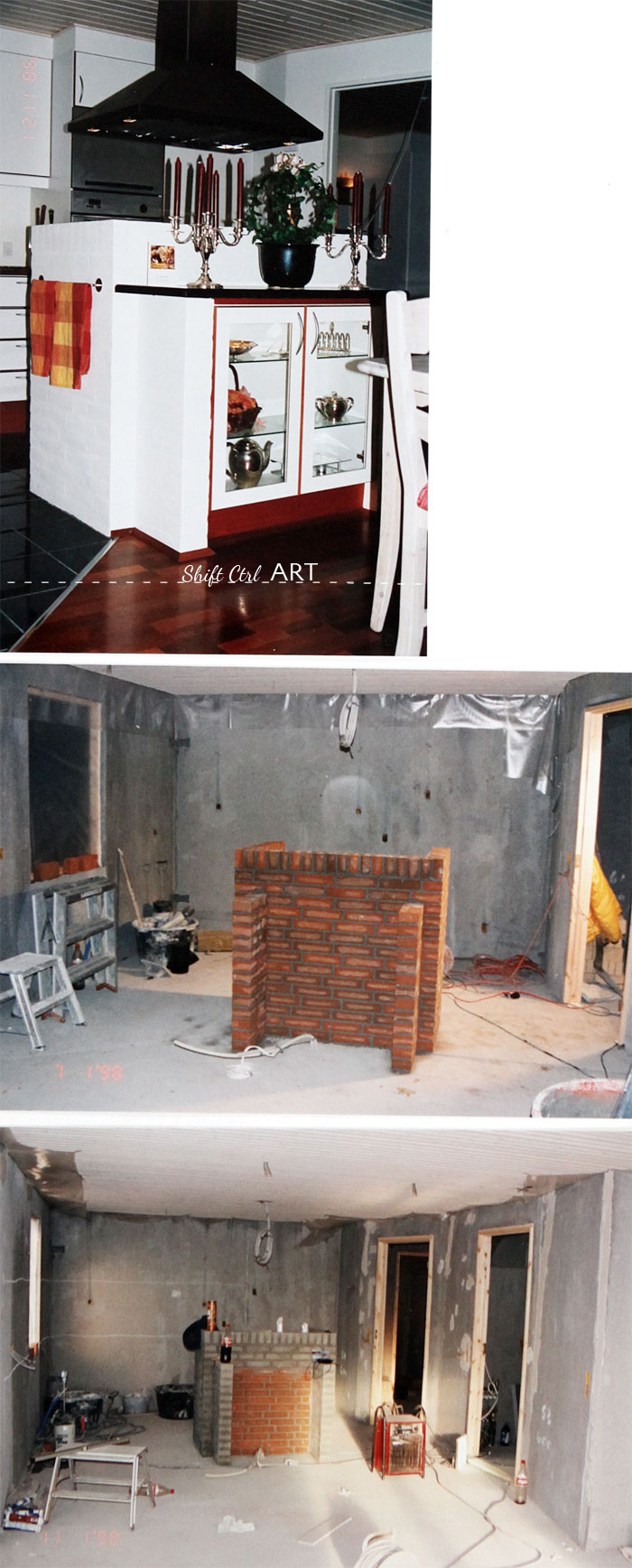
We had a brick island in the kitchen and had it treated with mortar or stucco like you see here. You could still see the brick, but the mortar grooves were mostly filled up. Hi Anne! This is for you!
I think that treatment still holds up today and it is a terrific way to deal with brick instead of just painting them. Now if only I knew what the treatment is called in English... I would tell you.
You trowel it on and use a damp sponge to wipe off the excess and expose some of the brick texture.
What I would not do again is to get that type of vent hood. I don't at all care for that triangular look anymore. We did do one great thing with it and that was to buy the motor for it separately and install it in the attic so you could not hear when the vent hood was on. That was so awesome!
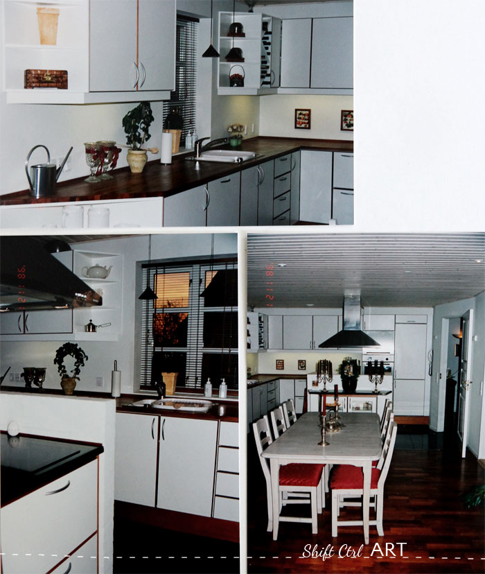
The cabinets. This was one of the builder basic styles - white laminate with filled cherry edges. Last year I saw a newly built house in Denmark with those exact cabinets proving that that style is still holding up today more than ten years later. I would not choose it again though. been there, done that.
Oh and don't even get me started on the hardware. That's the best they had back then. In our price range.
The fridge is built in and has the cabinet doors as fronts. The triangle shelves: so 90s!
I LOVE the floors we put in - they are mahogany. I also love the counter tops - we had butcher block around the perimeter and granite on the island.
The halls
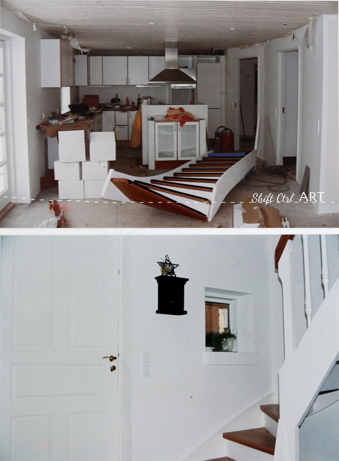
Here is the picture of the stairs when they were delivered. It came in two pieces. I was never in love with that stair case but it was the prettiest we could afford and that was available at the time.
We had tongue and groove ceilings all throughout the downstairs. I would do that again, but paint them white instead of pickling them. Pickling=80s+90s.
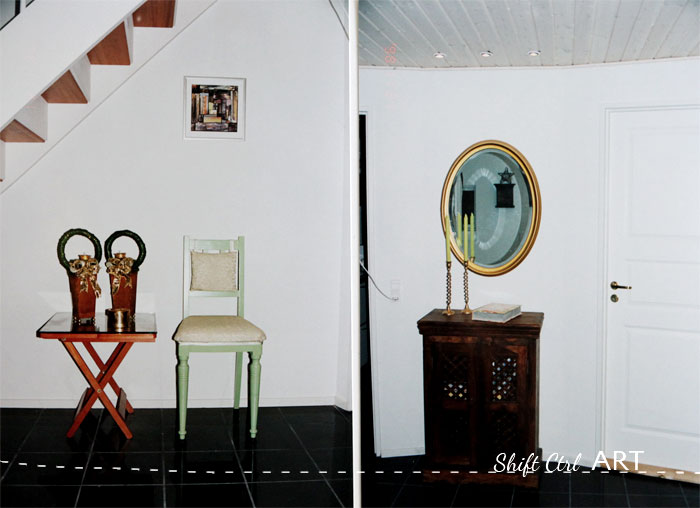
On the left: the first chair I ever re-finished. The lack of good fabric sources are obvious and that green is a bit minty. But other than that.. Woot woot! On the right: I still have that cabinet and I still LOVE it. I also have and still love the mirror. You have seen it in our current living room. I silver leafed it around 2002. Vintage IKEA. A gift from my parents.
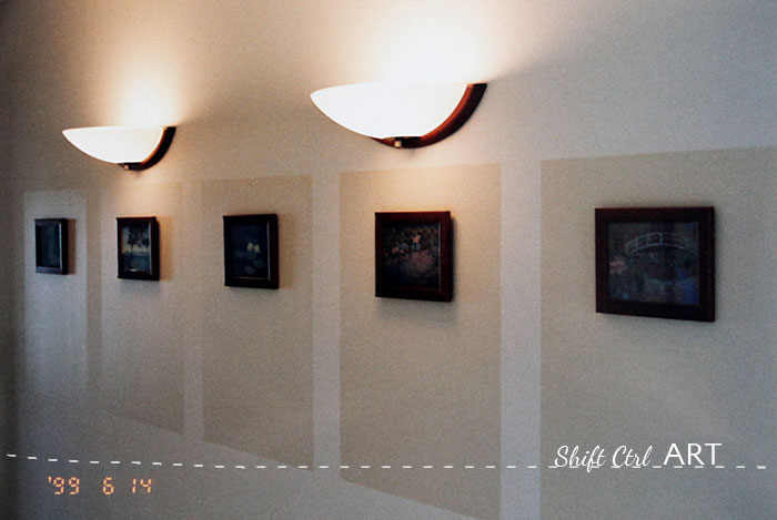
Upstairs hall: My first gallery wall. Cheap frames and post cards from IKEA. Painted beige squares on the wall and two wall lamps. June 14th 1999. You saw it here first An early Saturday morning DIY project. Can you imagine if blogs had been around then...
The master bath.
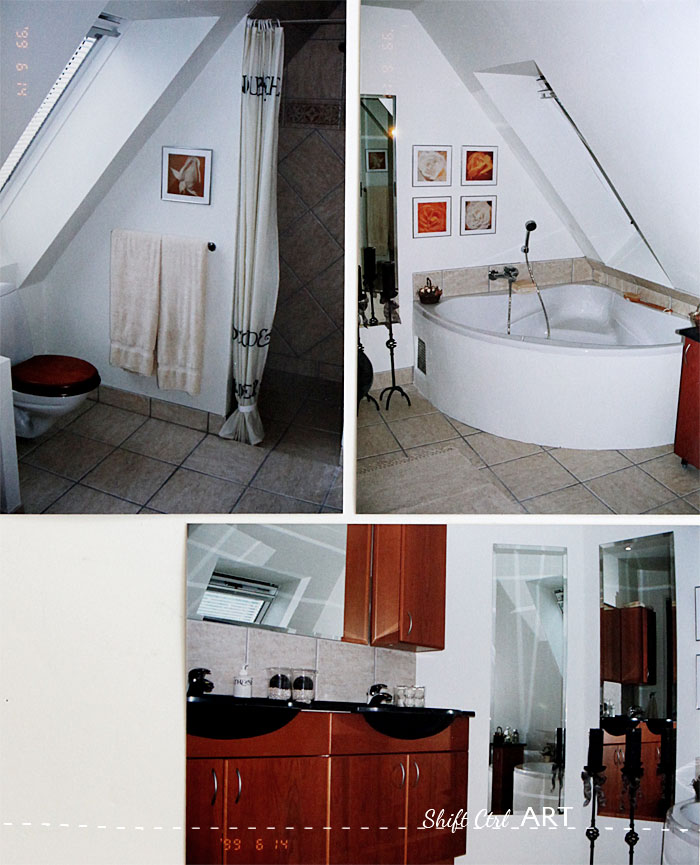
Corner tub - so 90s. The hardware - so 90s. The double vanities as half circles - so 90s. Wooden toilet seat. Did you see that IKEA is trying to bring that trend back? Would you be in to that?
The master bedroom.
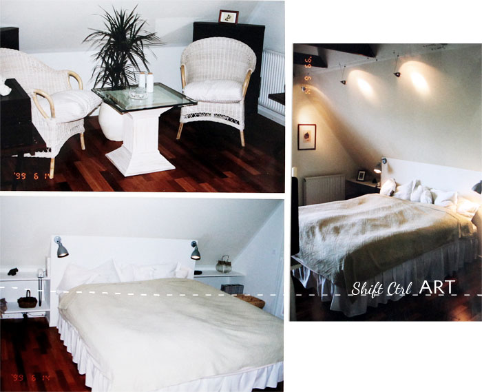
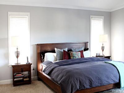
Dh and I DIYed that headboard with built-in shelves. That bedspread... remember when I dyed B's curtains and mentioned that I had dyed a bedspread before. That would be this bedspread. It was white when I got it and I dyed it in the big corner tub to match the paint on the walls.
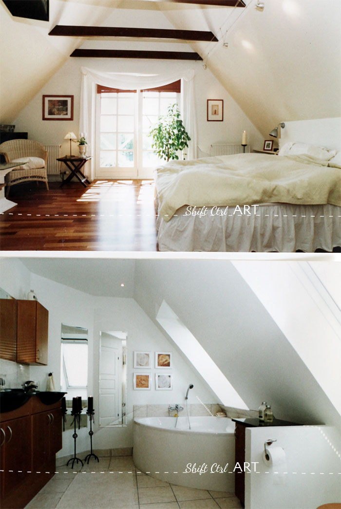
These two pictures are from the realtor. Love them! We were supposed to run drywall along the bottom of those exposed rafters, but instead we decided to expose them. I love how that turned out.
In the bathroom we had a little half wall built to separate the toilet from the bathtub a bit. Behind that a cabinet we put on casters.
The guest room.
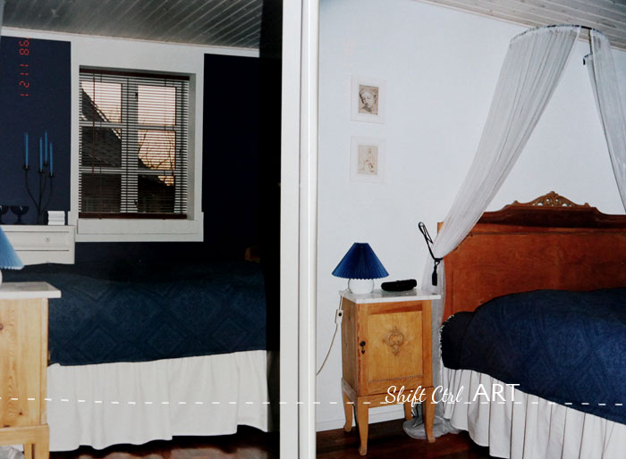
As I was painting that blue square on B's wall, I all of sudden thought.. hmmm this is so familiar.... Well look at what I did in our guest room back then. Painted one of the walls blue. Then I also got a blue bedspread and candles and bowls and and... and that was a bit much, but man that is a nice blue wall right there
The guest bath.
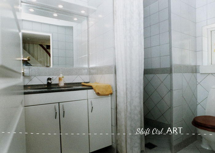
Cheap white tiles installed with bands of more expensive tile to save a buck. Now where have I seen that before... AND where have I seen that after. Everywhere! That's where! Our current guest bath is just one example.
The office.
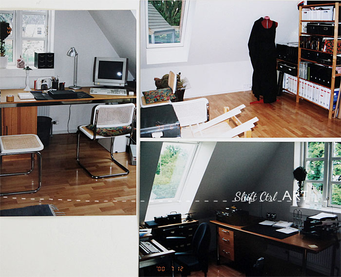
We never put up a wall between the two bedrooms upstairs, but instead used it as a one big office. And look: we had the Antifoni lamp from IKEA that is on practically every show on tv that shows an office. Mentalist is just one of those shows, but I spot them on TV all the time.
The living room.
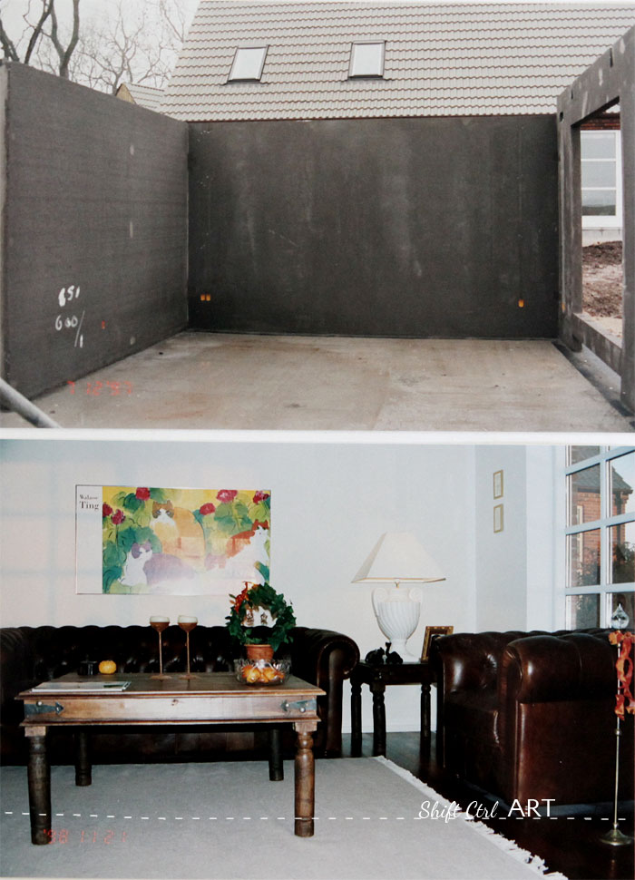
Recognize the sofas and the sofa table? Yup. Still have them. The cat picture now hangs in our stair well.
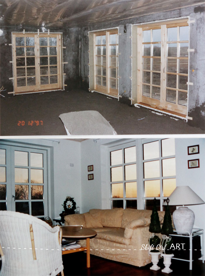
I reupholstered that sofa - twice. It started out very bright blue. Cobalt blue. Then it was orange for a while and then I sewed that cover for it in a yellow and beige damask. I still have left over fabric from that project.
We had 4 french doors - but two were fake - then were just picture windows. And yes - that is what we did again in this house because that is awesome and big bang for your buck. And you can then furnish infront of the windows when they don't open.
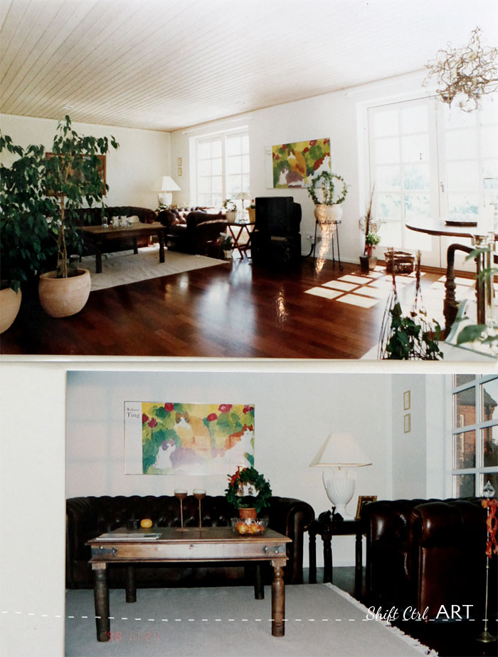
Ohhh recognize that Vine topiary next to the TV. Back then it was a real plant. Now it is of course the forever vine I showed you how to make a while back.
That's it! Our house from the 90s.
I think that some of the things we did were pretty timeless while other things SCREAM the 90s. Here is what I would definitely do again:
Hardwood floors through-out
Tongue and groove ceilings
Large hall
Master suite - with walk-in closet - that was practically unheard of in Denmark when we did that.
Large french doors to the outside. But with less mullions.
Solid counter tops like the ones we had in the bath rooms. They are like the Caesar stone counters of today.
Exposed rafters. Love that look.
That brick treatment on the island.
Floor to ceiling windows.
What about you. Are there any trends from the 80s or 90s that you still love today? Or any that you can't wait to see go?
See how we live now: Home Tour
Share

We used a building company for all the difficult stuff.
They
Made the foundation.
Set up all the downstairs walls.
Poured a level sub floor.
Did all the mason work incl. insulation on down stairs walls.
Put on the roof.
Installed the windows and exterior doors.
Did all electrical, plumbing and tiling.
Delivered all our materials.
We also had some help.
My parents came out 4 weekends and helped with the insulation upstairs (my dad) and with painting windows and filling walls (my mom).
My best friend's boyfriend and two of his friends came out one afternoon and helped us lift up the stairs - picture later - so it could be installed.
We hired someone to help with finishing the drywall around the sky lights. And to mud the drywall upstairs.
We hired a landscaper to lay all the outside pavers.
Dh and I did the rest:
Insulated the entire second floor.
Put up drywall - 12 ft or so to the tip of the slanted celings.
Put down sub floors upstairs.
Put down hardwood floors.
Put in all interior doors and installed hardware.
Installed all the tongue and groove ceilings down stairs.
Installed all the cabinetry in the kitchen, mudroom, bathrooms and guest bedroom.
Walls prepped and painted.
It took us about 4 months of working every day after work - getting off at 5pm - go to the house and work until 11pm. And every weekend from 8am - 11pm.
We sold the house in 2000 after living there about 2 years just before moving to the States.
It was a very fun project and we loved doing it.
Let's take a look. First up the floor plan.


On the lower picture you see the walls that were pre-fabbed at a factory. They were put up in only one day. The brick is attached to the outside with those metal wires you see in the concrete walls. Insulation was tucked in between.
You know how some people will say: I don't have any photos of that, because that was before I started blogging? Yeah... that's not me. I have been a blogger at heart even before it was a thing, I'm proud to say. I will save you the slew of pictures I have and only show this small collection that I have carefully curated. These top 40 pictures, focusing mostly of the "afters". The only room I don't have a picture of is the mud room. Boohoo. It had white cabinets with a gray counter top with a sink on the left and on the right it had a walk-in pantry and a built in bench/low table top for folding with a clothes lines arrangement above it and the laundry basket underneath it.
These pictures were all taken with our manual slr camera and
The foundation.

Dh waving in the background. Foundation walls delivered. Next picture: foundation walls up, third picture: me balancing on the foundation.
The exterior.

Here is the house as seen from the back yard. We had french doors upstairs in the Master bedroom. Those white crosses are a tell tale sign of the 90s.
The view.

Here is the view. Our lot ended down by the low row of plants. Behind there is a farmers field. In the far back where the threes and bushes are, was a little water hole/pond. I loved that view!
The kitchen:

We had a brick island in the kitchen and had it treated with mortar or stucco like you see here. You could still see the brick, but the mortar grooves were mostly filled up. Hi Anne! This is for you!
I think that treatment still holds up today and it is a terrific way to deal with brick instead of just painting them. Now if only I knew what the treatment is called in English... I would tell you.
You trowel it on and use a damp sponge to wipe off the excess and expose some of the brick texture.
What I would not do again is to get that type of vent hood. I don't at all care for that triangular look anymore. We did do one great thing with it and that was to buy the motor for it separately and install it in the attic so you could not hear when the vent hood was on. That was so awesome!

The cabinets. This was one of the builder basic styles - white laminate with filled cherry edges. Last year I saw a newly built house in Denmark with those exact cabinets proving that that style is still holding up today more than ten years later. I would not choose it again though. been there, done that.
Oh and don't even get me started on the hardware. That's the best they had back then. In our price range.
The fridge is built in and has the cabinet doors as fronts. The triangle shelves: so 90s!
I LOVE the floors we put in - they are mahogany. I also love the counter tops - we had butcher block around the perimeter and granite on the island.
The halls

Here is the picture of the stairs when they were delivered. It came in two pieces. I was never in love with that stair case but it was the prettiest we could afford and that was available at the time.
We had tongue and groove ceilings all throughout the downstairs. I would do that again, but paint them white instead of pickling them. Pickling=80s+90s.

On the left: the first chair I ever re-finished. The lack of good fabric sources are obvious and that green is a bit minty. But other than that.. Woot woot! On the right: I still have that cabinet and I still LOVE it. I also have and still love the mirror. You have seen it in our current living room. I silver leafed it around 2002. Vintage IKEA. A gift from my parents.

Upstairs hall: My first gallery wall. Cheap frames and post cards from IKEA. Painted beige squares on the wall and two wall lamps. June 14th 1999. You saw it here first
The master bath.

Corner tub - so 90s. The hardware - so 90s. The double vanities as half circles - so 90s. Wooden toilet seat. Did you see that IKEA is trying to bring that trend back? Would you be in to that?
The master bedroom.

Dh and I DIYed that headboard with built-in shelves. That bedspread... remember when I dyed B's curtains and mentioned that I had dyed a bedspread before. That would be this bedspread. It was white when I got it and I dyed it in the big corner tub to match the paint on the walls.

These two pictures are from the realtor. Love them! We were supposed to run drywall along the bottom of those exposed rafters, but instead we decided to expose them. I love how that turned out.
In the bathroom we had a little half wall built to separate the toilet from the bathtub a bit. Behind that a cabinet we put on casters.
The guest room.

As I was painting that blue square on B's wall, I all of sudden thought.. hmmm this is so familiar.... Well look at what I did in our guest room back then. Painted one of the walls blue. Then I also got a blue bedspread and candles and bowls and and... and that was a bit much, but man that is a nice blue wall right there
The guest bath.

Cheap white tiles installed with bands of more expensive tile to save a buck. Now where have I seen that before... AND where have I seen that after. Everywhere! That's where! Our current guest bath is just one example.
The office.

We never put up a wall between the two bedrooms upstairs, but instead used it as a one big office. And look: we had the Antifoni lamp from IKEA that is on practically every show on tv that shows an office. Mentalist is just one of those shows, but I spot them on TV all the time.
The living room.

Recognize the sofas and the sofa table? Yup. Still have them. The cat picture now hangs in our stair well.

I reupholstered that sofa - twice. It started out very bright blue. Cobalt blue. Then it was orange for a while and then I sewed that cover for it in a yellow and beige damask. I still have left over fabric from that project.
We had 4 french doors - but two were fake - then were just picture windows. And yes - that is what we did again in this house because that is awesome and big bang for your buck. And you can then furnish infront of the windows when they don't open.

Ohhh recognize that Vine topiary next to the TV. Back then it was a real plant. Now it is of course the forever vine I showed you how to make a while back.
That's it! Our house from the 90s.
I think that some of the things we did were pretty timeless while other things SCREAM the 90s. Here is what I would definitely do again:
Hardwood floors through-out
Tongue and groove ceilings
Large hall
Master suite - with walk-in closet - that was practically unheard of in Denmark when we did that.
Large french doors to the outside. But with less mullions.
Solid counter tops like the ones we had in the bath rooms. They are like the Caesar stone counters of today.
Exposed rafters. Love that look.
That brick treatment on the island.
Floor to ceiling windows.
What about you. Are there any trends from the 80s or 90s that you still love today? Or any that you can't wait to see go?
See how we live now: Home Tour
About Katja Kromann
I am a Danish American decorating life in Seattle. I love all things design and DIY.
I can’t think of anything more fun than coming up with project, making it, photographing it and sharing it with you on my websites.
Since 2018 I have been making Ceramics, nearly full time.
AHomeForCeramics.com AHomeForDesign.com AHomeForCrafts.com AHomeForFood.com My Portfolio
Categories
Memory lane - the house we built in the 90s - 40 photos is posted in the category Before & After | The House We built ...
