The kitchen - and its many challenges - Part I

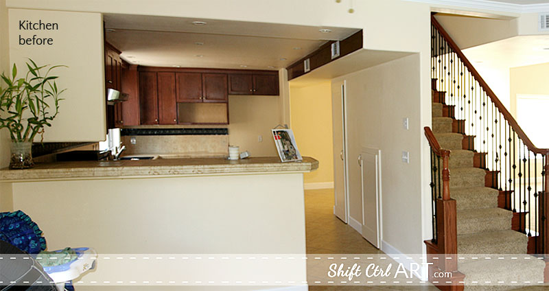
This is a picture of how the kitchen looked right before we bought it. Yes, more yellow and more of *that* tile - counters - walls - floor, but that is only a small percentage of the issues I had with this kitchen. Let's take a closer look.
Here is the kitchen floor plan.
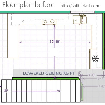
The kitchen measures just around 11 1/2 x 17 ft.
1. After moving in, the location of the fridge quickly turned out to be rather impractical. The dining room is to the left of the kitchen, so it made most sense to have plates and utensils toward that end. That meant a lot of trips jogging down to the fridge and back.
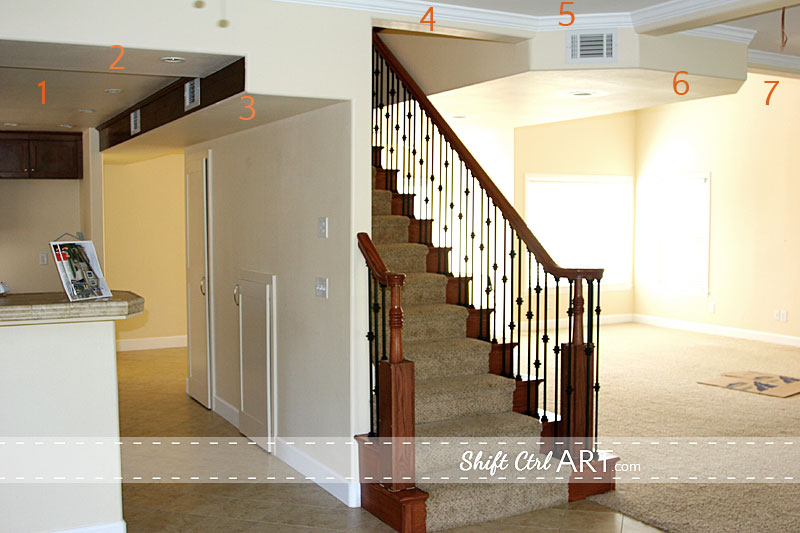
2. Ceiling heights. I counted 7 different heights from this vantage point. The living and dining room were an addition that the previous owners added, almost doubling the house in size. If you can imagine - the opening into the kitchen is where the old exterior wall was. The room over on the right is the original living room. I was standing in the new dining room when I took this picture. Those ceilings look like an upside-down Tetris game to me.
As you can see, they had run into quite some interesting decision making when it came time to add vents and merge the original 8ft ceilings with the 9ft ceilings of the addition. 7 different ceiling heights, that's just too many, don't you agree?
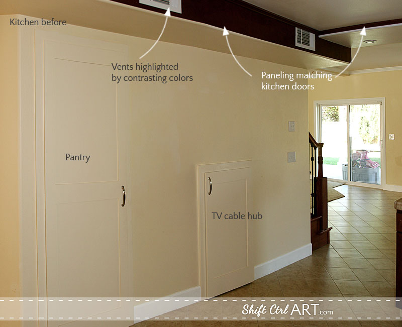
3. A long blank wall in a kitchen? Why? And two doors trying to be all stealth. Now you see me, now you ... ok I just see you.
4. Bulk heads accentuated with paneling that further highlighted the white vents and the different ceiling heights. And two vents, no less.
The door on the left was a pantry door. I LOVE having a pantry. This was definitely a great idea. The pantry is located under the staircase.
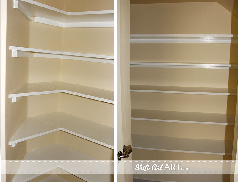
Here you see inside the pantry. The shelves on the left have an angle to it. We will get to why that is in a minute.
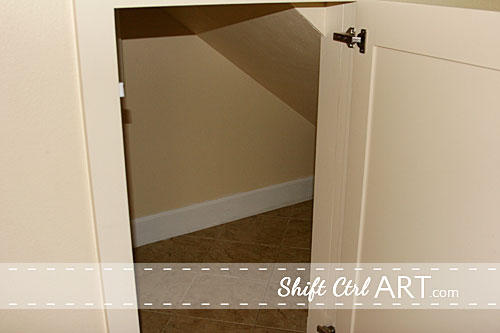
And this is looking into the other small cabinet on the big blank wall. Inside here, they had connected all of the AV and phone lines to the entire house.

5. What is this mystery cubby? This kitchen did not have a microwave, which seemed a little odd. For a while I was thinking this was their spot for the microwave, but that after installation they 1. realized an upper cabinet was not deep enough for a microwave and 2. they forgot to wire in power for it. The other option is that they thought it would be a decorative display area. In that case I did not understand why it was not finished with the brown wood of the doors, but instead sported the tan laminate of the cabinet interiors.
6. Then there was that row of black and silver tiles.
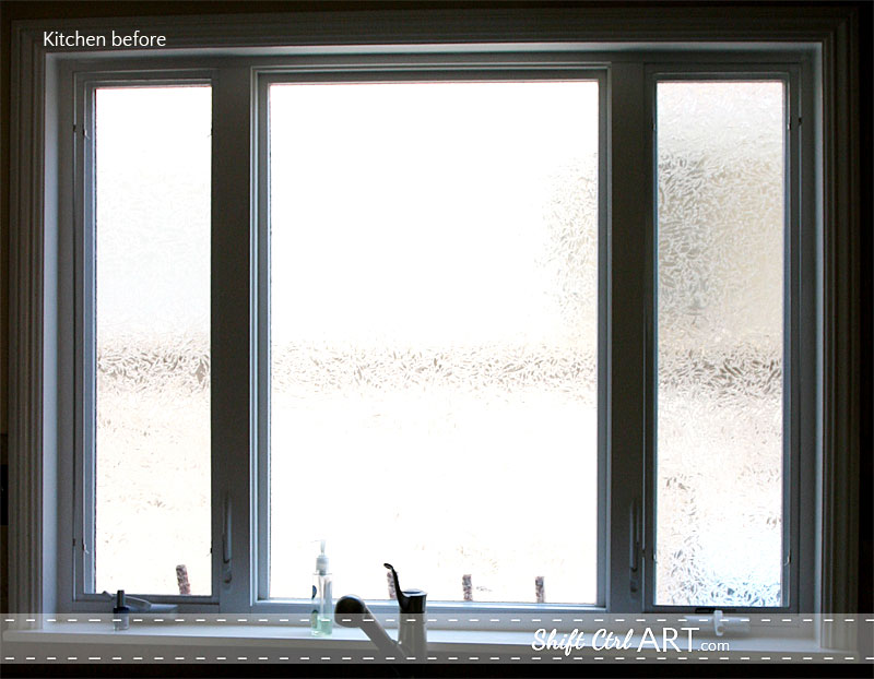
7. The window over the sink. It has bathroom glass in it. Let me say that again. IT HAS BATHROOM glass in it. I can tell you why they did that though. The kitchen looks into the side yard of our neighbor's house and a brick wall, so it's not the prettiest view. I have some ideas for that, though.
I am going to show you this picture again for the next part.
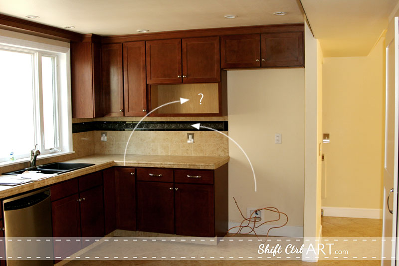
On the right side you see that 2 ft bulk head that is overhanging the blank wall? It is housing the vents to the kitchen. 2 feet is too narrow for a walk way out of the kitchen. Their solution? ....
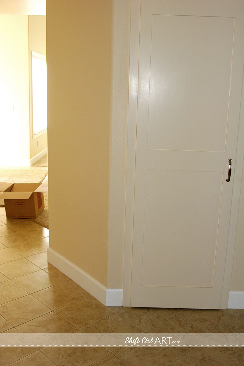
8. The 45 degree wall angle. Well, not quite... you see how it is not lining up with the tile that is installed at an angle as well. This is the explanation for the missing corner of the pantry and the angled shelves inside it.
Here is the rest of the kitchen looking towards the dining room on the left.
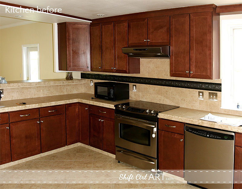
9. See that "free-hanging" corner cabinet? What is that? You could not reach anything in this cabinet because it was so far back. And when we took it down, we found a (live) pot-light in the ceiling (shaking finger and smacking tongue). Now, I can only guess what happened here. That cabinet was clearly an afterthought as evidenced by the pot-light being installed above it. My best guess is that they had a wrong delivery of corner cabinets because the corner cabinet in the other corner is another type (?) but then decided to use it after all.
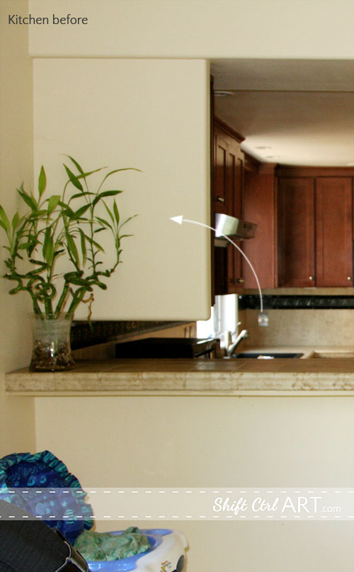
Here is what that corner cabinet looked like from the other side. They had fabricated a lovely small wall piece (That was not tied into the wall). It was overhanging the bar completely except for the small space you see where the plant is hanging out. So you could not actually sit there unless you wanted to feel like you were sitting facing a wall.
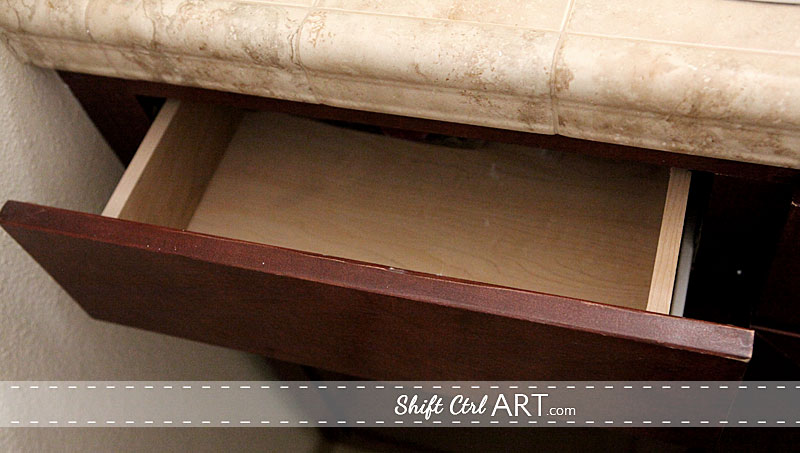
10. The final challenge is more of a general issue I had with the cabinets. I think they were made of balsa wood. They were extremely light weight and hollow sounding. The gliders on the drawers were not good. The drawers themselves were small compared to the openings. They did not come out all the way when pulled out, so you never knew what was at the far back.
The cabinets had that tell tale sign of poor quality: center post. Center posts take out a big portion of the usability of the middle of every cabinet. It's just not very user friendly. Of course no soft-close or self-close features on the doors and drawers.
Here is the kitchen - before - again in all its glory.

At this point most people ask me why we bought the house if we didn't like any of the finishes. Here is why:
This house had my top three must haves:
1. Location, location, location. Nice, quiet family neighborhood close to shopping and restaurants.
2. Big back yard - rare in Southern California.
3. Living room faces the back yard - not the street, as is most common around here and it has 9ft ceilings.
When we first walked into this house, we loved it, but before we even considered buying it, I had already said that I would only buy it if we could change the staircase and we both wanted to re-do the kitchen. So in a way it was a good thing that there weren't any expensive cabinets or granite.
So, even though the kitchen might have looked really good at first glance, as you can see there were several issues that warranted us declaring this a "fixer" kitchen. I hope this clears it up to the many people who where puzzled as to why we would tear down a practically new kitchen that "looked great".
We donated all cabinets and appliances to Habitat for humanity.
What do you think the deal was with the mystery cubby or the "free-hanging" corner cabinet? Any theories you care to share?
Next: Demo in the Kitchen Part II - let the remodeling begin!
Share

Here is the kitchen floor plan.

The kitchen measures just around 11 1/2 x 17 ft.
1. After moving in, the location of the fridge quickly turned out to be rather impractical. The dining room is to the left of the kitchen, so it made most sense to have plates and utensils toward that end. That meant a lot of trips jogging down to the fridge and back.

2. Ceiling heights. I counted 7 different heights from this vantage point. The living and dining room were an addition that the previous owners added, almost doubling the house in size. If you can imagine - the opening into the kitchen is where the old exterior wall was. The room over on the right is the original living room. I was standing in the new dining room when I took this picture. Those ceilings look like an upside-down Tetris game to me.
As you can see, they had run into quite some interesting decision making when it came time to add vents and merge the original 8ft ceilings with the 9ft ceilings of the addition. 7 different ceiling heights, that's just too many, don't you agree?

3. A long blank wall in a kitchen? Why? And two doors trying to be all stealth. Now you see me, now you ... ok I just see you.
4. Bulk heads accentuated with paneling that further highlighted the white vents and the different ceiling heights. And two vents, no less.
The door on the left was a pantry door. I LOVE having a pantry. This was definitely a great idea. The pantry is located under the staircase.

Here you see inside the pantry. The shelves on the left have an angle to it. We will get to why that is in a minute.

And this is looking into the other small cabinet on the big blank wall. Inside here, they had connected all of the AV and phone lines to the entire house.

5. What is this mystery cubby? This kitchen did not have a microwave, which seemed a little odd. For a while I was thinking this was their spot for the microwave, but that after installation they 1. realized an upper cabinet was not deep enough for a microwave and 2. they forgot to wire in power for it. The other option is that they thought it would be a decorative display area. In that case I did not understand why it was not finished with the brown wood of the doors, but instead sported the tan laminate of the cabinet interiors.
6. Then there was that row of black and silver tiles.

7. The window over the sink. It has bathroom glass in it. Let me say that again. IT HAS BATHROOM glass in it. I can tell you why they did that though. The kitchen looks into the side yard of our neighbor's house and a brick wall, so it's not the prettiest view. I have some ideas for that, though.
I am going to show you this picture again for the next part.

On the right side you see that 2 ft bulk head that is overhanging the blank wall? It is housing the vents to the kitchen. 2 feet is too narrow for a walk way out of the kitchen. Their solution? ....

8. The 45 degree wall angle. Well, not quite... you see how it is not lining up with the tile that is installed at an angle as well. This is the explanation for the missing corner of the pantry and the angled shelves inside it.
Here is the rest of the kitchen looking towards the dining room on the left.

9. See that "free-hanging" corner cabinet? What is that? You could not reach anything in this cabinet because it was so far back. And when we took it down, we found a (live) pot-light in the ceiling (shaking finger and smacking tongue). Now, I can only guess what happened here. That cabinet was clearly an afterthought as evidenced by the pot-light being installed above it. My best guess is that they had a wrong delivery of corner cabinets because the corner cabinet in the other corner is another type (?) but then decided to use it after all.

Here is what that corner cabinet looked like from the other side. They had fabricated a lovely small wall piece (That was not tied into the wall). It was overhanging the bar completely except for the small space you see where the plant is hanging out. So you could not actually sit there unless you wanted to feel like you were sitting facing a wall.

10. The final challenge is more of a general issue I had with the cabinets. I think they were made of balsa wood. They were extremely light weight and hollow sounding. The gliders on the drawers were not good. The drawers themselves were small compared to the openings. They did not come out all the way when pulled out, so you never knew what was at the far back.
The cabinets had that tell tale sign of poor quality: center post. Center posts take out a big portion of the usability of the middle of every cabinet. It's just not very user friendly. Of course no soft-close or self-close features on the doors and drawers.
Here is the kitchen - before - again in all its glory.

At this point most people ask me why we bought the house if we didn't like any of the finishes. Here is why:
This house had my top three must haves:
1. Location, location, location. Nice, quiet family neighborhood close to shopping and restaurants.
2. Big back yard - rare in Southern California.
3. Living room faces the back yard - not the street, as is most common around here and it has 9ft ceilings.
When we first walked into this house, we loved it, but before we even considered buying it, I had already said that I would only buy it if we could change the staircase and we both wanted to re-do the kitchen. So in a way it was a good thing that there weren't any expensive cabinets or granite.
So, even though the kitchen might have looked really good at first glance, as you can see there were several issues that warranted us declaring this a "fixer" kitchen. I hope this clears it up to the many people who where puzzled as to why we would tear down a practically new kitchen that "looked great".
We donated all cabinets and appliances to Habitat for humanity.
What do you think the deal was with the mystery cubby or the "free-hanging" corner cabinet? Any theories you care to share?
Next: Demo in the Kitchen Part II - let the remodeling begin!

About Katja Kromann
I am a Danish American decorating life in Seattle. I love all things design and DIY.
I can’t think of anything more fun than coming up with project, making it, photographing it and sharing it with you on my websites.
Since 2018 I have been making Ceramics, nearly full time.
AHomeForCeramics.com AHomeForDesign.com AHomeForCrafts.com AHomeForFood.com My Portfolio
Categories
The kitchen - and its many challenges - Part I is posted in the category Before & After | Kitchen
