Powder room turned full bath part III - the reveal
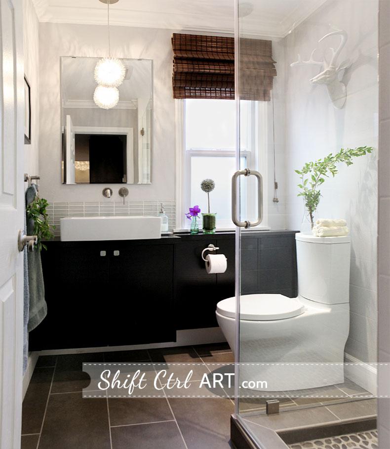
I am so incredibly happy with how this guest bath turned out. From that little idea in my head, to reality. By far the most remodeling we have done to any room in the house, and we have done quite a bit of it.
Let's first take another a quick peek at the bathroom before:
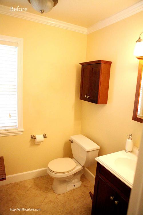
It was just so yellow before. Take a look at some more befores here and the mood board.
Then we did all the behind the scenes stuff. You know, plumbing and plumbing and more plumbing. For all your plumbing images needs, take a look here.
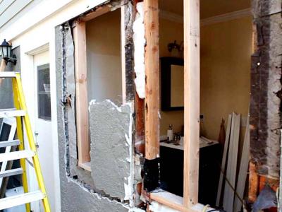
We also moved the window
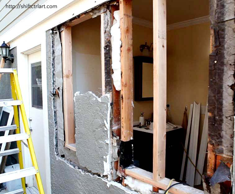
Looks so weird, right?
We needed to make space for the new vanity that would go where the window was. We could have just left the window, but I really wanted a mirror there. For another type of house you could have done other things for a mirror, like a swing arm mirror or something like that, but for this house, we both felt it was best to go all the way and move the window over.
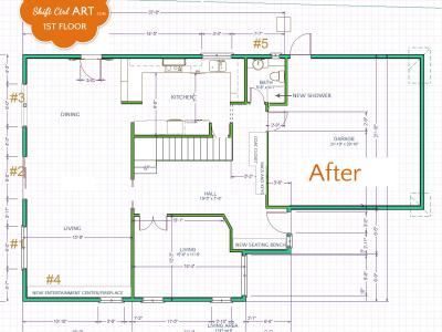
Here is how we shuffled the floor plan around:
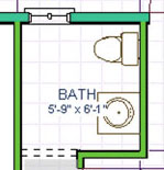
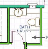
Floor plan before Floor plan after
Here are the after photos. You know, the good stuff... Don't you just love a before and after post? I love it so much I dedicated a whole category to it!
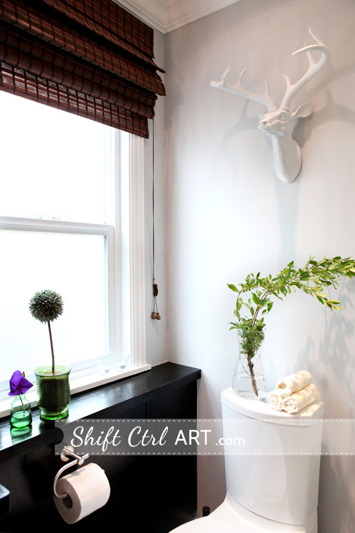
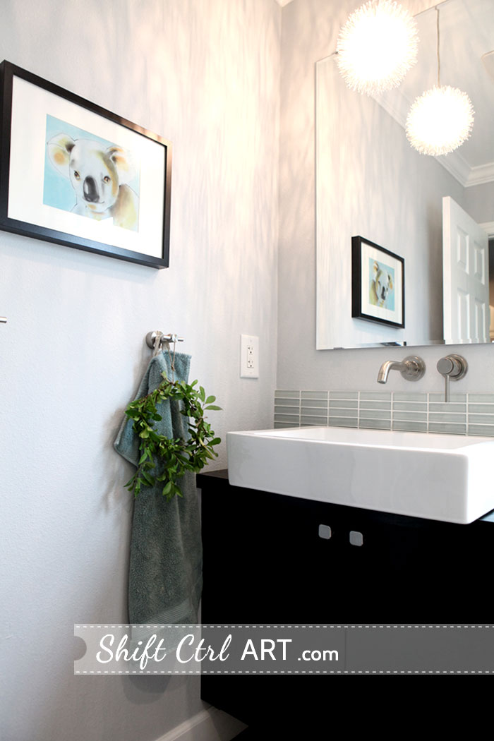
Yes I made a little wreath and hung it on the towel hook. Because.
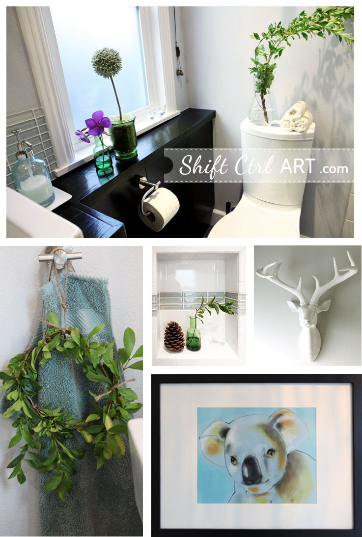
Our powder room turned full bath!
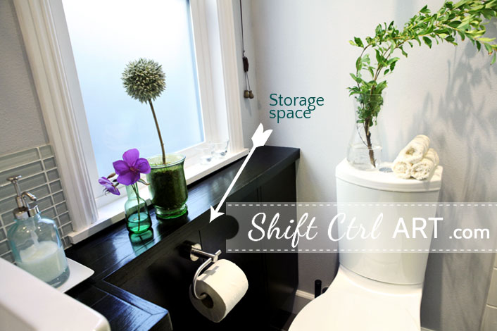
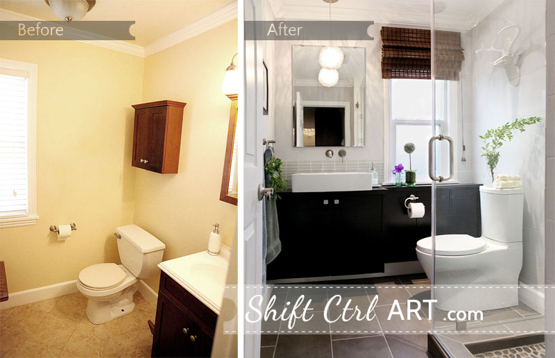
There are two main design elements, that I think make this room work and feel uncluttered even though it's a three piece bath now in a 36 sq ft space. First, we made the vanity shallow but let it span the entire focal wall which makes it seem substantive without taking up a lot of room.
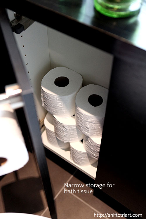
The vanity is only 12 inches deep below the sink, and only 5.5 inches on the very shallow part - where the toilet rolls are stored. The sink comes out over the edge of the tabletop by a couple of inches.
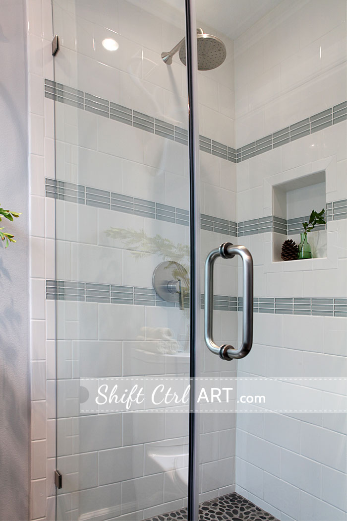
The second element is the clear glass shower enclosure which makes the shower nearly invisible. Nearly. I think it works really well.

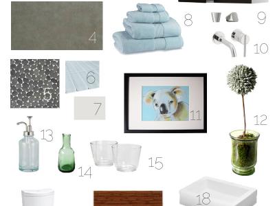
Here is the list of materials we used.
Paint color Silver Setting by Dunn-Edwards.
Deer head. What is a bathroom without a deer head? ZGallerie.
Nexus wall cabinets. IKEA
Light gray cement colored ceramic 12x24 floor tile, Marazzi tile
Tahiti Unpolished Pebble Tile, Big Sky Flooring
Loft Natural White polished1x4in glass tile, The Glass Tile Store.
White porcelain 6x8 subway tile, Home Depot
Bath towels - aqua, Bed Bath & Beyond
Bastig knobs, IKEA
Grohe Atrio wall mount faucet, FaucetDirect
My son's artwork
DIY topiary. I posted about it here
Soap dispenser, Target
Green mini vase here, IKEA
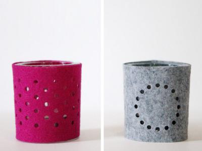
Glass Votives, IKEA
Kohler Persuade Comfort height with Saile quiet close seat, FaucetDirect
Levelor mahogany roman shade, Lowes
Ron Bow vessel sink, FaucetDirect
American Standard Berwick rain shower head and lever, FaucetDirect
Possini dandelion pendent, Lamps Plus
I have to tell you, we learned so much about bathrooms and plumbing and digging up garage floors from this project. Almost more than I ever wanted to know.
It was fun and at times frustrating, but in the end incredibly rewarding.
---
Want to see our other IkeaHackers.net feature? Our entertainment center with fireplace was featured in October last year.
Living room entertainment center with fireplace
---
And the bathroom one more time side by side:
More remodel here
The kitchen - and its many challenges - Part I
Update - August 2013: I was contacted by Better Homes and Gardens to have my bathroom featured in an upcoming issue. The came and shot my bathroom last week.
Read all about the photo shoot and get some behind the scenes details here:
Better Homes and Gardens photo shoot - vini, vidi, vici
Share
Let's first take another a quick peek at the bathroom before:

It was just so yellow before. Take a look at some more befores here and the mood board.
Then we did all the behind the scenes stuff. You know, plumbing and plumbing and more plumbing. For all your plumbing images needs, take a look here.
We also moved the window

Looks so weird, right?
We needed to make space for the new vanity that would go where the window was. We could have just left the window, but I really wanted a mirror there. For another type of house you could have done other things for a mirror, like a swing arm mirror or something like that, but for this house, we both felt it was best to go all the way and move the window over.
Here is how we shuffled the floor plan around:


Floor plan before Floor plan after
Here are the after photos. You know, the good stuff... Don't you just love a before and after post? I love it so much I dedicated a whole category to it!


Yes I made a little wreath and hung it on the towel hook. Because.


Our powder room turned full bath!
There are two main design elements, that I think make this room work and feel uncluttered even though it's a three piece bath now in a 36 sq ft space. First, we made the vanity shallow but let it span the entire focal wall which makes it seem substantive without taking up a lot of room.
The vanity is only 12 inches deep below the sink, and only 5.5 inches on the very shallow part - where the toilet rolls are stored. The sink comes out over the edge of the tabletop by a couple of inches.
The second element is the clear glass shower enclosure which makes the shower nearly invisible. Nearly. I think it works really well.

Here is the list of materials we used.
Paint color Silver Setting by Dunn-Edwards.
Deer head. What is a bathroom without a deer head? ZGallerie.
Nexus wall cabinets. IKEA
Light gray cement colored ceramic 12x24 floor tile, Marazzi tile
Tahiti Unpolished Pebble Tile, Big Sky Flooring
Loft Natural White polished1x4in glass tile, The Glass Tile Store.
White porcelain 6x8 subway tile, Home Depot
Bath towels - aqua, Bed Bath & Beyond
Bastig knobs, IKEA
Grohe Atrio wall mount faucet, FaucetDirect
My son's artwork
DIY topiary. I posted about it here
Soap dispenser, Target
Green mini vase here, IKEA
Glass Votives, IKEA
Kohler Persuade Comfort height with Saile quiet close seat, FaucetDirect
Levelor mahogany roman shade, Lowes
Ron Bow vessel sink, FaucetDirect
American Standard Berwick rain shower head and lever, FaucetDirect
Possini dandelion pendent, Lamps Plus
I have to tell you, we learned so much about bathrooms and plumbing and digging up garage floors from this project. Almost more than I ever wanted to know.
It was fun and at times frustrating, but in the end incredibly rewarding.
---
Want to see our other IkeaHackers.net feature? Our entertainment center with fireplace was featured in October last year.
Living room entertainment center with fireplace
---
And the bathroom one more time side by side:

More remodel here
The kitchen - and its many challenges - Part I
Update - August 2013: I was contacted by Better Homes and Gardens to have my bathroom featured in an upcoming issue. The came and shot my bathroom last week.
Read all about the photo shoot and get some behind the scenes details here:
Better Homes and Gardens photo shoot - vini, vidi, vici

About Katja Kromann
I am a Danish American decorating life in Seattle. I love all things design and DIY.
I can’t think of anything more fun than coming up with project, making it, photographing it and sharing it with you on my websites.
Since 2018 I have been making Ceramics, nearly full time.
AHomeForCeramics.com AHomeForDesign.com AHomeForCrafts.com AHomeForFood.com My Portfolio
Categories
Powder room turned full bath part III - the reveal is posted in the category Before & After | Decor | Guest Bathroom
