How to make your own upholstery fabric - from sketch to color accuracy to fabric textures
With the green guest bedroom finished, let me tell you about how I made the fabric for the bed upholstery. I'll show you how I set up the pattern in Illustrator before diving into what sort of color accuracy you can expect. I'll show you samples. Finally I want to talk a little bit about the texture and wearability of the fabric and what, if anything, I would do differently next time.
Let's dive in.
I knew that I wanted to try my hand at upholstering the bed in the green guest room. I think that would go so well with the late 40s, early 50s style of our house. And I wanted the fabric to have many different greens, but done in a way that it would be both a 'wild pattern' yet read as a solid at the same time. Oh and I wanted it to be a Pacific North Western style print. Not tropical or desert inspired. No cacti. I know, shocking, right?
I search. And searched. And searched some more. After several weeks and many outings, my search had yielded these four fabrics.
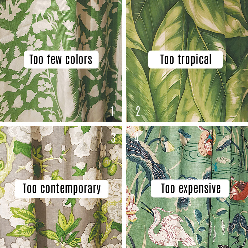
Find these fabrics here 1, 2, 3, 4
So pretty. Here is why they didn't work for my project.
- The first pattern is quite lovely and I really like the birds on it too, but it only has one green color and so much white. And I have seen this so many places so it wouldn't really be that unique looking. But overall I really like this pattern. I would definitely use this in another application. It's so pretty.
- The next one has the right idea with the leaves, but it is so tropical looking and it just isn't grabbing me in terms of leaf variance or coloring. It reads a little bit 70s which I really want to avoid for this house.
- This to me is a very pretty pattern. It looks like something that would be on a piece of furniture from Pottery Barn. It is a bit too flowery for me and it has too much gray and white and not enough greens. The 'prettiness' also doesn't work with this house I think. It is too contemporary as well. I want something a little more gender neutral. Masculine-leaning even.
- This last fabric has the right idea. I love that it is so green overall and the crane even looks a little Asian which is very much on point for the style of the house although don't expect to see too much of this influence in my design. It has a nice vintage vibe too. But.... At a price tag of over 170 dollars per yard and the bed needing 4 yards. Mmmm yeah.... no. I do love the sophistication of this fabric though. In a world of money trees and unicorn farts, this is the one I would have gone with.... But back to reality.
So then I started thinking. Could I make a patterned fabric myself? I have never done that, so like any, uhm, sane person I jumped at the chance. After all, I love a good challenge.
Welcome to my 2 month journey.
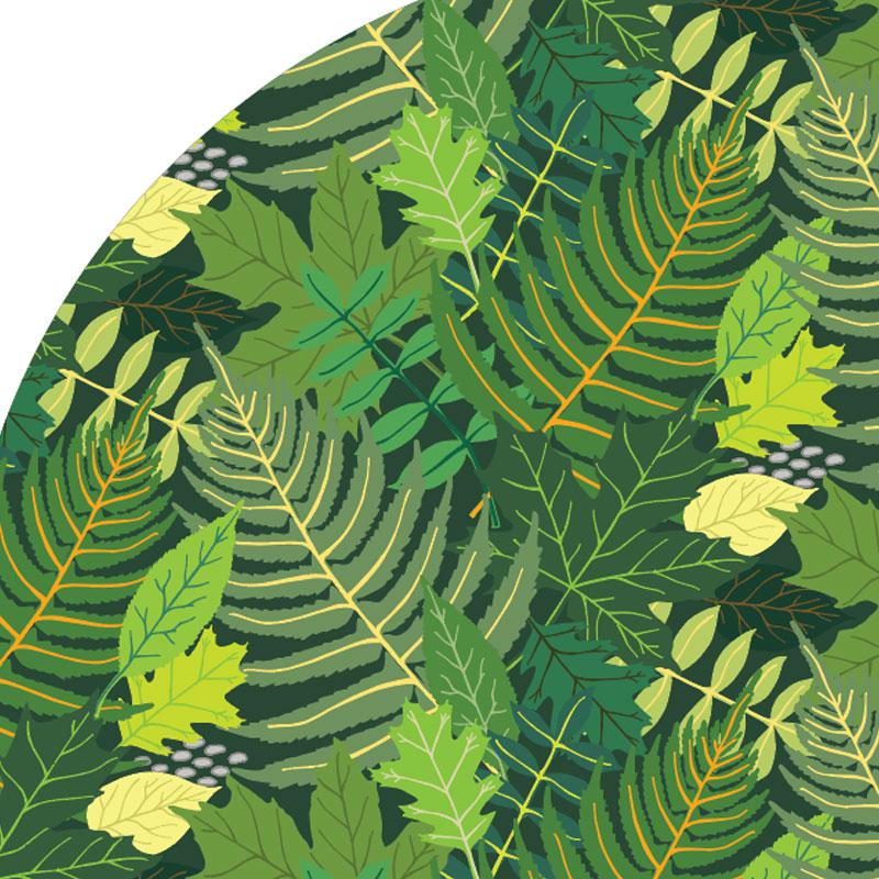
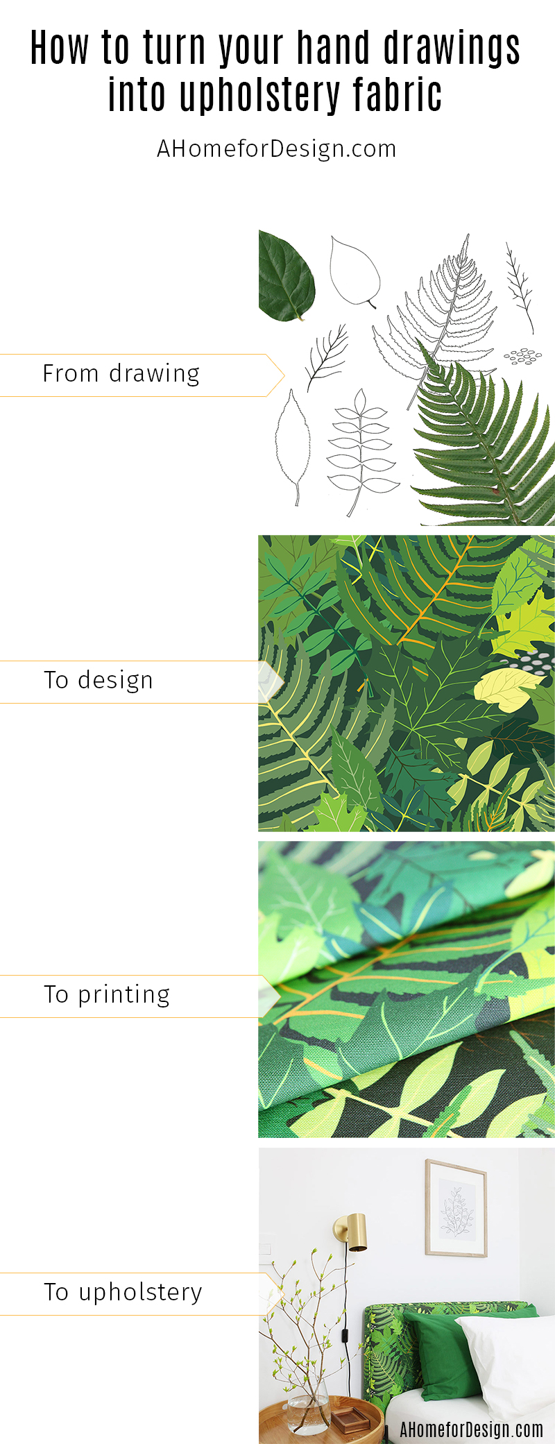
I went out into my yard and started collecting some leaves. Then sketched them. Then used a black marker to draw the final outlines. I drew the outlines of the leaves themselves separately from the veining because I knew that I wanted each leaf to have a contrasting veining. This would be a way to add interest and more greens.
The two green leaves below are a lemon leaf and a fern leaf. I also drew a maple leaf and oak leaf and a couple of which I don't know the names.
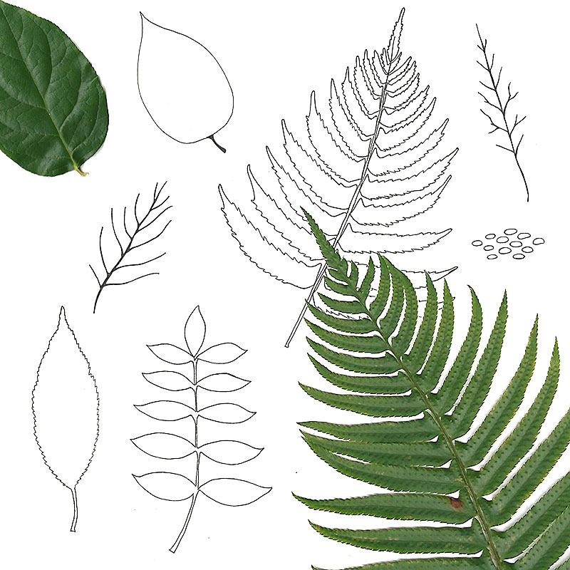
I imported the drawings into Illustrator and Image Traced them, then filled them with color and overlaid the veining on top of the leaves. I made at least two color versions of each leaf to have enough colors and interest. I was going for a 'rainbow of green' if that makes any sense. I wanted both warmer greens and cooler greens all mixed together.
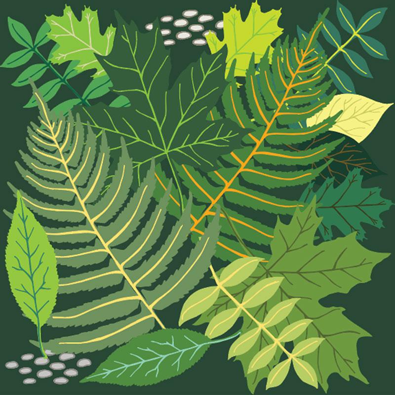
This was my pile of leaves that I had when I began making the pattern. I wanted this to be a large scale print, so I put them inside a 20x20 inch square at 150 dpi so that it would have the right scale for printing later. Yes, note that while 300 dpi is common in printing, only 150 dpi was specified for this application by Spoonflower where I would later print the fabric.
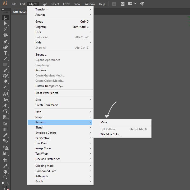
Illustrator has a fantastic pattern maker built right in and it is fairly easy to use. After selecting the square and leaves I clicked on Object, Pattern, Make.
This opens up the pattern maker and you see your original square and then a repeat all around but in a less saturated version so you can discern which is which once they start to intermingle. You can clearly see the border between each square at this point because none of the leaves hang over the edges yet, so that is next. The Pattern Options box lets you choose what type of pattern repeat you want such as a grid repeat which you see as a default. But you can choose other kinds in the drop down. I chose a half drop pattern which means that the pattern is copied straight out to the left, then dropped down 50%, This creates sort of a diamond pattern if you will. Or a vertical brick pattern. It helps hide the repeats a little bit.
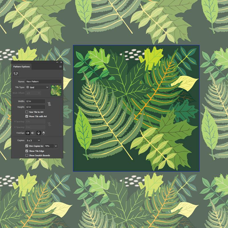
Here in the next picture, all I have done is move the lower left fern leaf (white arrow points to it) so that it overhangs the left and bottom edges. You can see that this makes all the other leaves in the other tiles do the same (Still showing a grid pattern here)
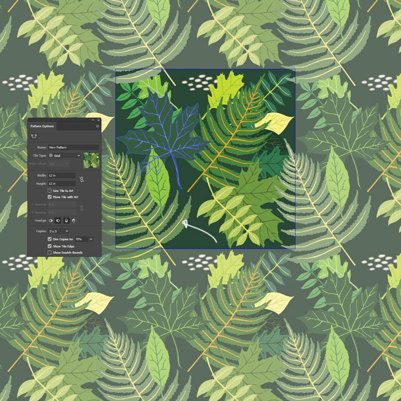
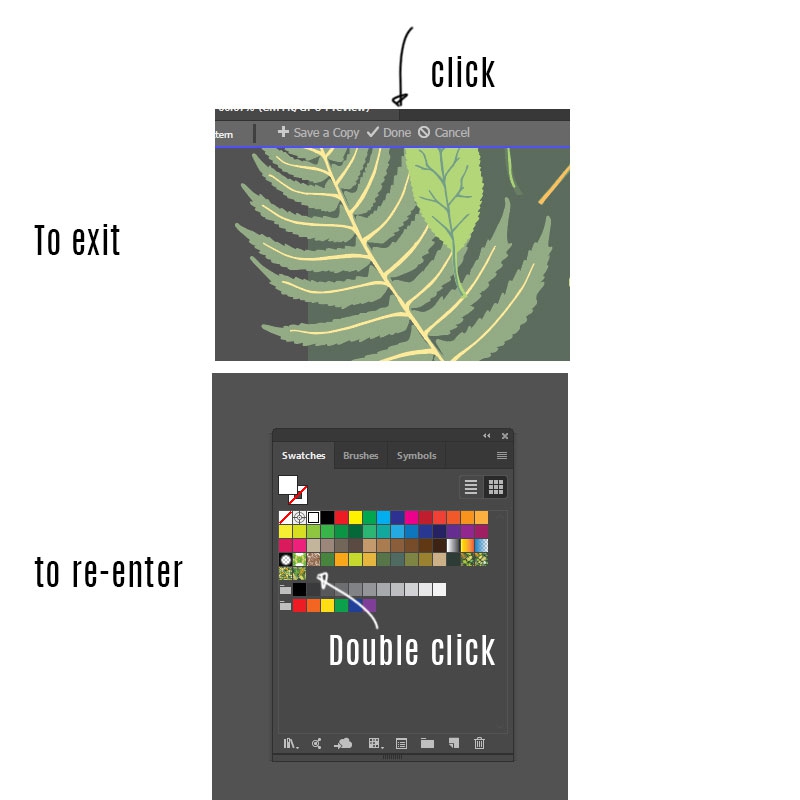
Then you pretty much just start moving leaves around until you like the effect. Then you exit the pattern maker and test it out to see if anything stands out or you have a sparse spot and things like that.
To exit the pattern maker you click Done at the top right. To enter back into the pattern maker, it made a little swatch of the pattern in the swatches palette. If you double click the swatch it opens the pattern maker back up. It looks like this:
When you exit it will also show you a tile of your repeat. Depending on the grid style and complexity of your pattern this can look simple or wild. As you can imaging with my pattern it looks a little wild. Here you can clearly see the half drop pattern as well.
You then test the pattern by making a big circle and clicking the swatch in the swatches palette. It fills your circle with a seamless repeat. It is pretty spectacular. This really lets you hunt down any errors or bald spots in your pattern pretty quickly. At this point you pretty much want to drop everything else in life and just make patterns all day long.
But then dinner time rolls around and those dreams are quickly squashed. Oh well. If only I were Sherlock Homes. You know, with Mrs. Hudson just arriving with a tray with tea and what-nots at certain intervals, so you can keep working without having to stop for mundane tasks. When that money tree blooms I am so hiring Mrs. Hudson. Then there will be all the patterns everywhere.
How to cut out your repeat tile
Now with my wild pattern, this tile will not make sense if I just save it all as one big thing. I need to find the exact square of the repeat. Here is how you do that.
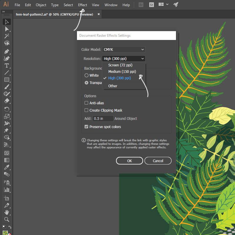
First double check that you did set your document dpi/ppi to 150 by clicking Effect, Document Raster Effects Settings and clicking on the Resolution drop down. That way the size of the pattern tile will translate to the same size on the fabric after you upload. If the dpi is 300, then the pattern would print up twice as large, so that won't work.
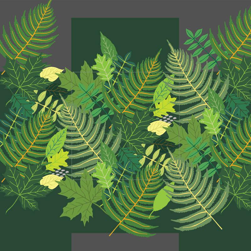
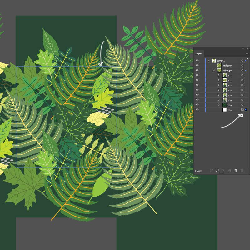
Next, go to the swatches palette and click and drag your pattern over into illustrator onto an empty artboard.
Then, go to the layers palette and unfold the bottom layers of the pattern. At the very bottom you click the circle icon on the right of that layer - see white arrow. This lights up a blue outline exactly around where the repeat is in the pattern - see the other white arrow below. See the faint blue box?
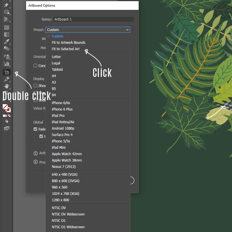
With the tile boundary now selected as shown by the blue outline above, you want to make the artboard the same size so that you can save just that part. Here is how you do that. Double click on the Artboard tool in the tool menu. This opens up the Artboard Options, then click Fit to Selected Art. That now makes it so that the artboard takes up the exact spot behind your tile (You can't really see it because of the green background color which covers it, but it's there).
Then you save your tile by clicking File, Export, Export As...
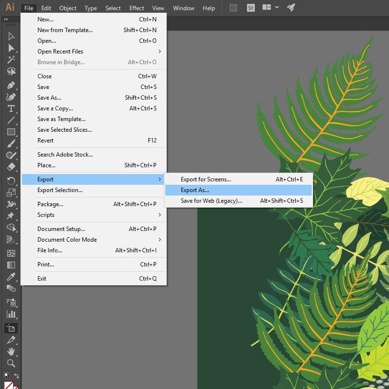
And in the ensuing dialog box you check of 'Use Artboards', click on 'Range' and then whatever number your artboard is. If you only have one, chances are it is number 1 unless you really had fun in your document. If you really don't know what number it is you have to go back into the document, and click on the artboard tool in the tool menu. It will display the number of each artboard in the upper left corner of each artboard. Make a mental note of that. Then repeat the above steps to export.

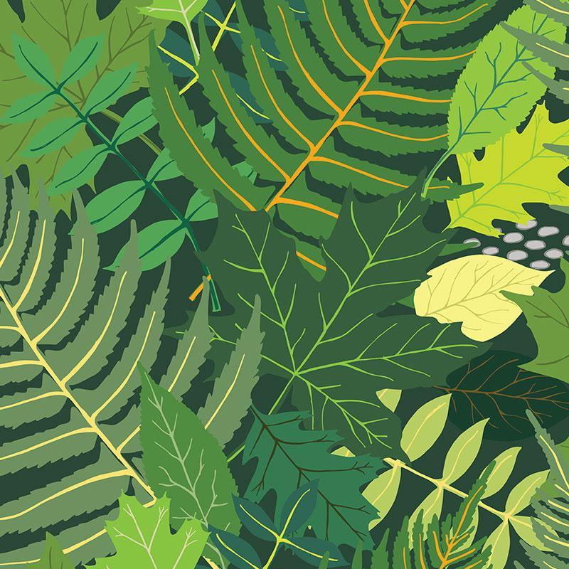
I saved mine as a png and it then looks like this. (Except I shaved off the edges of mine here so it can't be easily copied).
I printed mine with Spoonflower.com and it is fairly intuitive to do that over on their site. The only trouble shooting I had to do was when I uploaded some line art for some gift wrap I wanted to print. I found that if the number of pixels aren't divisible with an whole number Spoonflower's web rendering tool has a bit of trouble showing the tile repeat perfectly. So while your tile may be working perfectly well for printing, it will not show up perfectly in the thumbnail due to web scalability issues. But of course you begin to doubt if something is wrong with your tile which leads to a bunch of double checking and then talking with their very nice support team.
The best way to triple check your pattern that I found was to open up your tile in Photoshop and load it into Pattern fill. Then make a large square and fill it up with the pattern. If you don't see any issues here, then even though you do see them on Spoonflower's website, it shouldn't show up on the actual pattern. Of course this leaves you with a big problem if you want to sell your patterns over there because the general public will also see the pixel issue and you may very well lose sales on that because the average customer will surely not know these intricate details of pattern making, nor should they have to and Spoonflower does not at present time have any information about it for the customers. The only real solution is to have your pattern be divisible by a whole number... Which is next to impossible to accomplish with intricate patterns unless you just change them at the very end and then have the pattern screw a little bit and I don't know how that would impact the repeat. I would have to test that out first. I might do that next time but between finding out all this information and all the research it took to come this far, I was in no mood to mess with the tile once I knew it was 'perfect'. So there is that.
The next thing to consider when printing your own fabric is that it is by no means a fast process. It takes over a week, if not 10 days, to get your swatch back and then it takes several weeks after that to have the actual length of fabric printed and sent you you. Between drawing, making the pattern, getting the swatch and getting the actual fabric AND you know ... life... it ended up taking a couple of months all in all. It's a project for the patient minded.
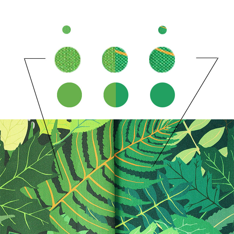
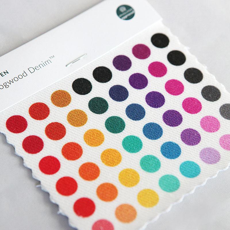
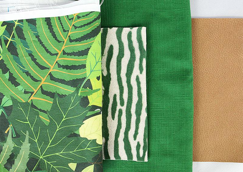
But. When the fabric swatch finally arrives you are just so excited to see your design coming to life. I ordered large swatches, the tea towel size, because my pattern is such a large scale. That was the only way I would be able to see the repeat lines. I ordered Canvas Linen and Eco Canvas. Here they are side by side. Canvas Linen on the left. My repeats came out perfectly. But what about the color?
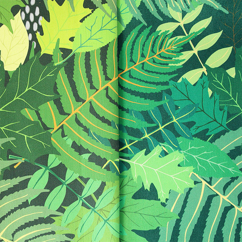
As you probably are noticing there is a rather large difference in the hue of the greens with the Canvas Linen on the left matching the swatch pretty well, whereas the Eco Canvas on the right is considerably more blue in the overall hue.
I sent pictures to Spoonflower to inquire about this noticeable difference. I was given the explanation that Canvas Linen is a cotton product while Eco Canvas is a Polyester product and that Polyester takes the dye more so it becomes more saturated than the way the cotton takes the color. Ok, fair enough, but it wasn't so much the increase in saturation that I was concerned about, but much more the variance in hue. Saturation is how bright or deep the color is while hue is a change in the color from warm to cold or from a more yellow green to a more blue green. The first will make your fabric look more intense than you expected but the latter will make it possibly fall out of your color scheme. Not good. The tech person I spoke with at Spoonflower said the following about this issue:
"The change in hue is due to the difference in fabric as well. For example, our Eco Canvas fabric is printed on a brighter white fabric as it is only made with polyester. Our Linen Cotton Canvas Ultra is a natural fiber fabric, how white the fabric is will vary and this may also be why your design has a different hue as well. "
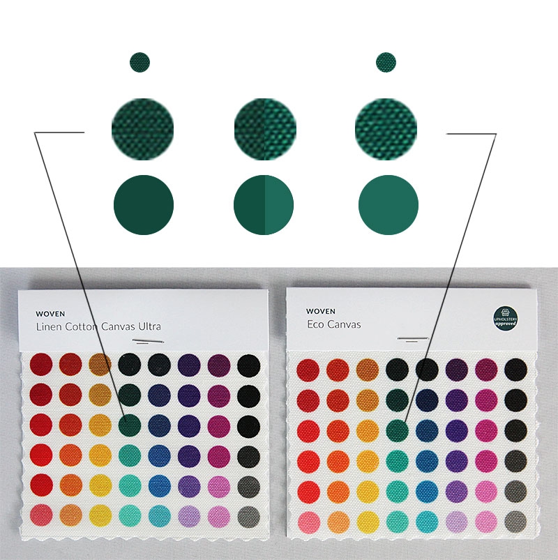
Ok, I then decided to order their box of color swatches as well. It was quite illuminating. Here is what I found. Below are their color samples of the Canvas Linen (left) and their Eco Canvas (right). Here I picked the third green from the top of each swatch and enlarged them so you can see them better. I then gauged the color of each and made a solid colored spot underneath. In the middle I made a half of each and put them together so it is easier to see.
Now in all fairness, the color of something in real life as compared to color of something on a screen is like apples and oranges. The fact that there is light coming through the images from the screen already makes a huge difference in how the color is perceived so you can only be so accurate when talking about colors in this way.
With that in mind let's try anyway.
When I look at the two swatches side by side in the photo and look at all the different colored dots the first thing that strikes me is that they match up pretty well hue-wise. I do see a little more saturation in the Eco swatch compared to the Linen swatch, but wouldn't you agree that it is negligible? The biggest different I am noticing is the next to last row that is purple. That top most spots are pretty different between the two. The same for the third green dot which I chose. Other than that. Pretty 'spot' on I would say.
Let us look at my fabric swatches to compare - again Linen Canvas is on the left, Eco Canvas is on the right. Here I did the same. I sampled the leaf part of the fern in each sample, then approximated a solid color, then compared the two. Is it just me or is the difference between my two swatches bigger than the difference between the color swatches above?
Here I am showing you the color picker from Photoshop. First the greens from the color samples. You can see that the dot in the green to black squares are at different spots - this corresponds with the difference in saturation. On the right side of each of those is the rainbow slider which is the hue slider. Notice how both arrows are pointing around the green to turquoise area indicating the hue is about the same?
Now look at the the row below. This is from my fabric samples. Look at the rainbows again and see just how far apart the arrows are pointing from one another. On the left one I see the arrow being towards the bottom third of the green going towards yellow, where as the right side has the arrows much further up, almost at the top of the green before it starts going turquoise. A much wider spread in hue difference.
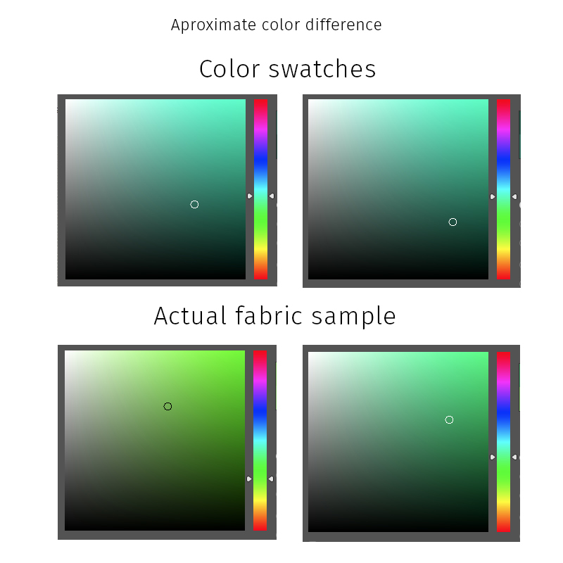
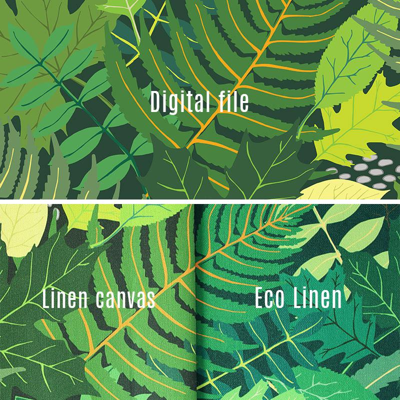
Now let us look at the digital file compared with the swatches I received. As you can see there is a bit of difference between the tile and the Linen Canvas swatch, but overall I am so impressed with how well it matches. The hue is just on the money. The Eco swatch on the other hand. Not so much.
I think my take away from this is that you can talk about color issues from now until dooms day. That is not what I am about. I just want something that is within a certain range. It is so hard to compare a digital square that is lit from behind with a fabric with texture. With that being said, I do think a mistake was made in the coloring of the Eco Canvas when compared to their own swatches. I just don't see the variance in their own swatches as I do in the sample I was sent. This is just to say watch out for printing on polyester compared to printing on cotton where I think they got my fabric TOTALLY right and I am so happy with it!
I told Frank the story and he said, "well, what did you expect them to say?" (Only in Danish, because we speak Danish). I guess I expect them to either say that the way the Eco canvas printed was a mistake or to chance their color swatch to mimic the hue change. Or something third I didn't think of.Ok, enough about that. I think novel length articles have probably been written or at least thought up when it comes to printing issues as they pertain to colors. It's a big and complicated issue. At least you are aware now of the experience I had. And maybe you disagree. I would love to hear what you think in the comments.
Fabric texture and thickness
I chose the Linen Cotton Canvas. It is not specified for upholstery so please make a note about that and it is definitely not sturdy enough for upholstery of an item that sees a lot of use like a bench or chair. It is very suitable for drapes and craft items like zipper bags and things like that. It would also be great for throw pillows and even a jacket or some pants with structure. On that note, should I sew a suit in this fabric? Ok, I won't. But admit it would be funny. Looking.
Our green guest bed is only going to see light use so I went for it. And the price is definitely right. I think I paid around 37 dollars per yard. For one of a kind fabric. Can't beat that.
I do wish that Spoonflower made this texture and type of fabric (Linen!) In an upholstery weight, though, and maybe with a little bit more texture in the linen. I think that would be so popular.
They do make a denim fabric which is much thicker. I have plans to use this for a future project that will see heavier use. I am not as enthusiastic about the denim texture though, to be honest, but this is the fabric I would use on a chair for example. It is still not 'upholstery upholstery' quality but quite a bit heavier and more sturdy than the canvas linen.
If you know of a place that prints upholstery fabric at a reasonable price, please let me know in the comments. I would love to try out different places.
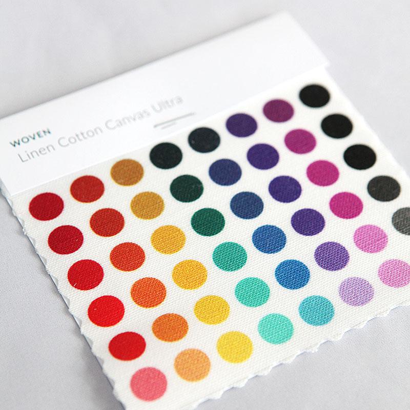
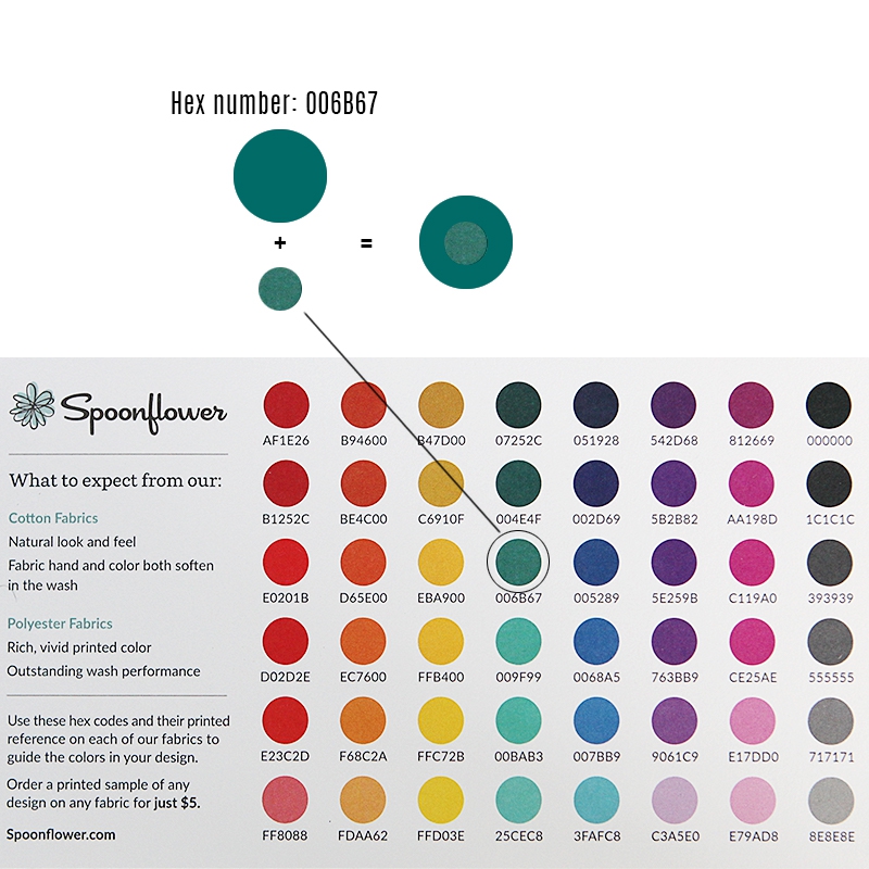
With your order, Spoonflower supplies you with a Hex number swatch card as well. Very handy. I tested it for the green here by making a colored dot using the hex number they specified, and then inserting a dot from their swatch on top. It practically disappears. Very satisfactory I think. I haven't tested it in a real life application though.
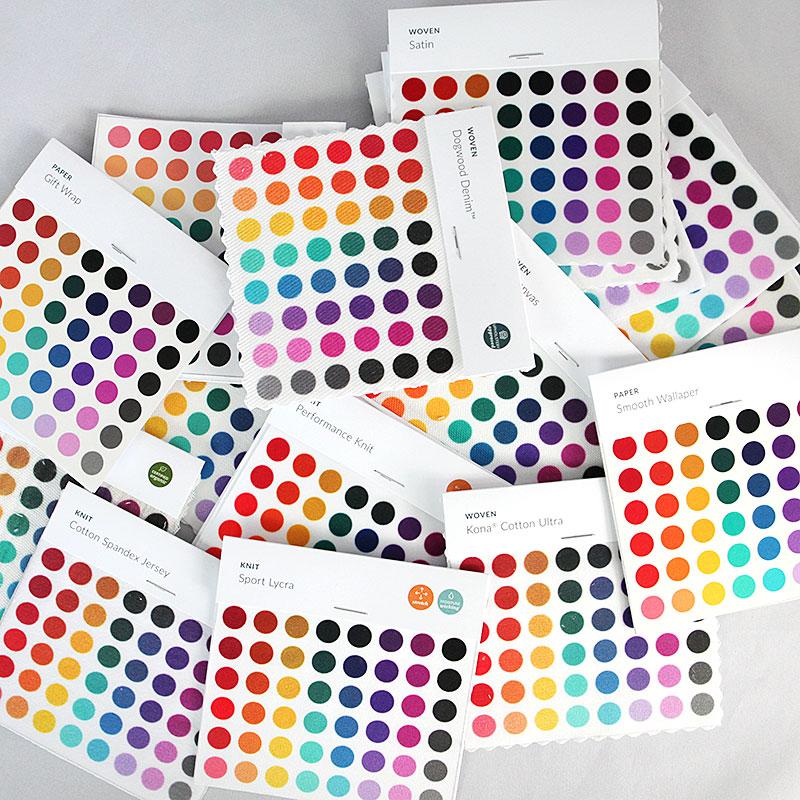
Here are all the samples you get in the pack. Quite a few. They have so many different types of fabrics. Mostly geared towards garment and project making.
I can't wait to make some more fabrics with them.
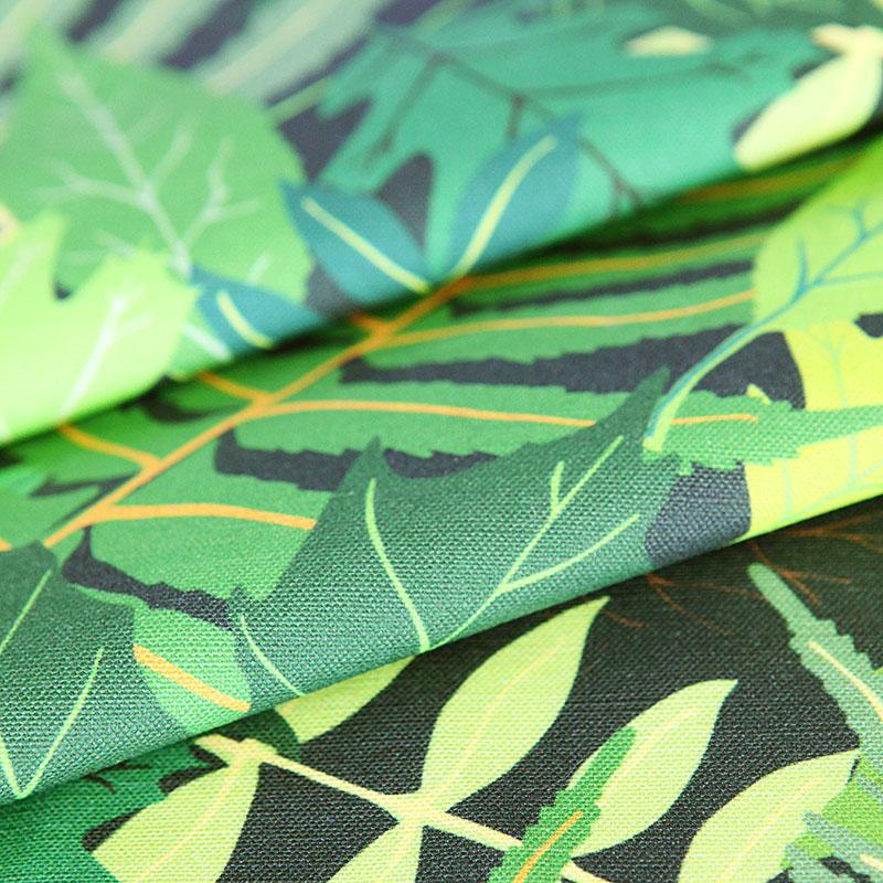
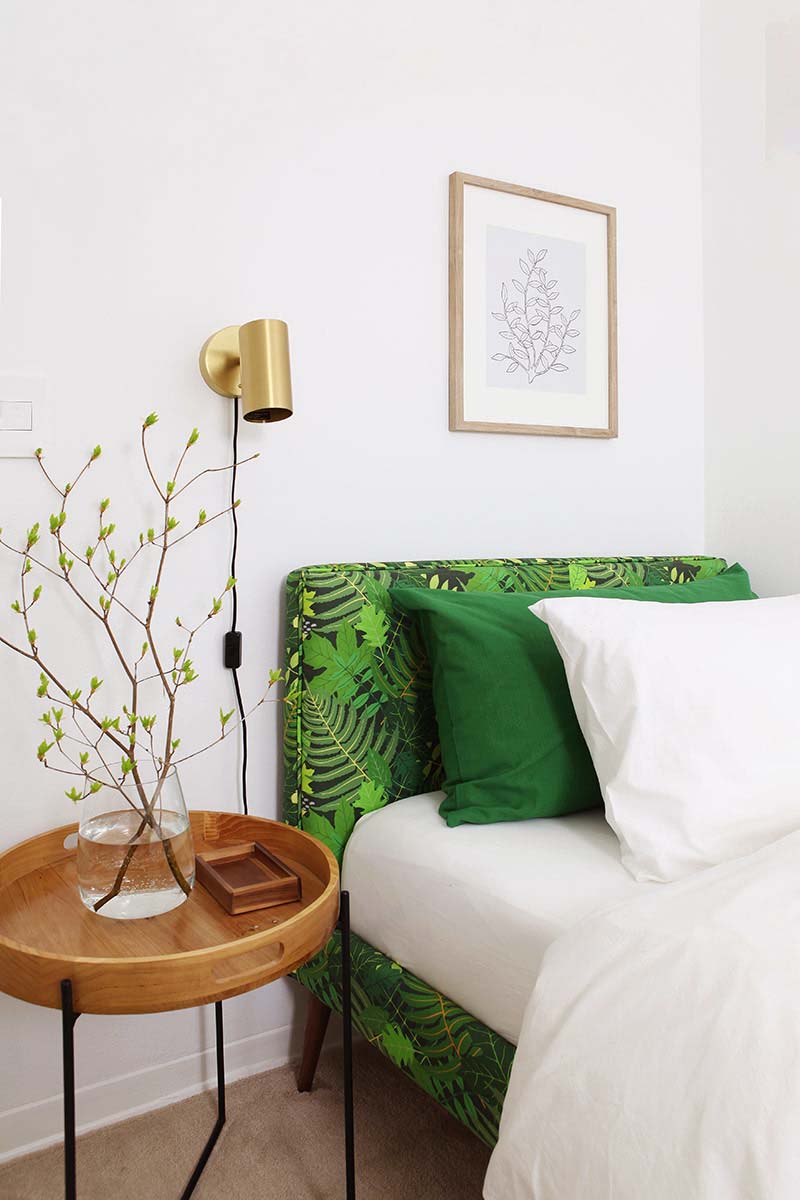
Here is the close up of the final fabric when it came in ready for me to upholster the bed. I can't get over how beautifully it came out. It is better than I expected I have to say.
The upholstery project will be a separate post in the very near future.

And here is the fabric color scheme I ended up with for the green guest room.From the left: Bed, valance, bed pillow, bench upholstery.
Video sources
In preparation for making my pattern I watched a ton of videos. Here are some of the ones that really helped me: Create a seamless pattern in Illustrator, How to cut the tile
This video is mostly aspirational but oh so good: Fabric pattern design. This video I only found today, but it is really good too: Make an intricate pattern in Illustrator.
Please pin this:
I am a Danish American decorating life in Seattle. I love all things design and DIY.
I can’t think of anything more fun than coming up with project, making it, photographing it and sharing it with you on my websites.
Since 2018 I have been making Ceramics, nearly full time.
AHomeForCeramics.com AHomeForDesign.com AHomeForCrafts.com AHomeForFood.com My Portfolio