The kitchen pantry - before and demo

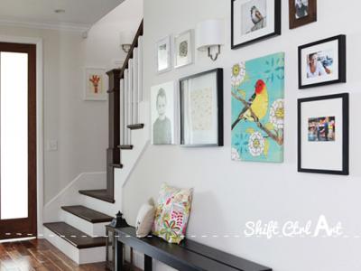
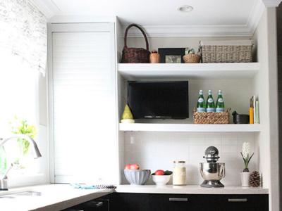
Welcome to our old pantry. Well, our pantry door on the left there. This was our long blank wall in the kitchen before we remodeled it to take advantage of this unused space.
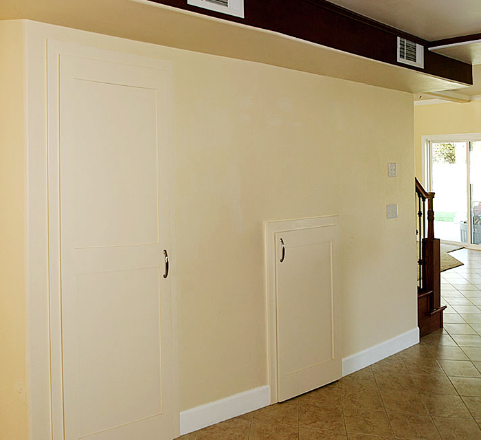
One of the things we wanted to fix was the appearance of the bulk head as well as this 45 degree corner going from the kitchen into the hall.
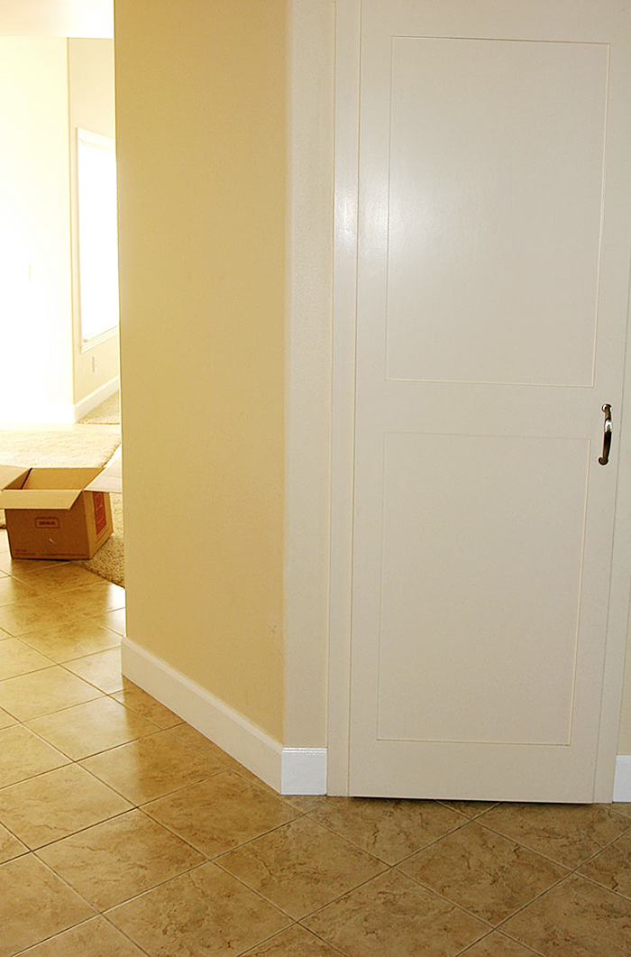
And the pantry was not maximizing the space available due to the angle cutting it off. Here is the closet inside. Not too bad, though.
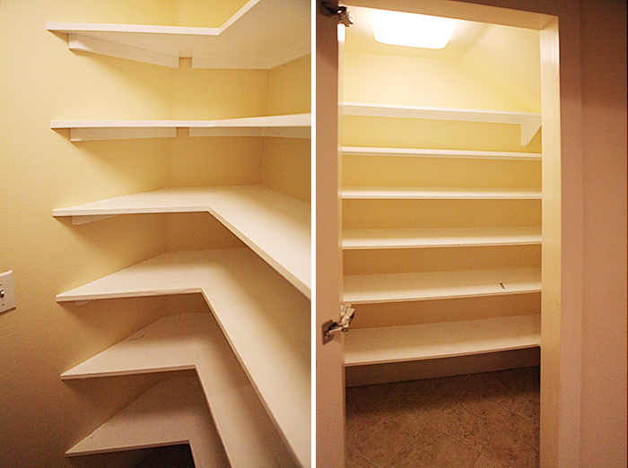
6 good shelves in a walk in pantry. Very dreamy already. So much potential.
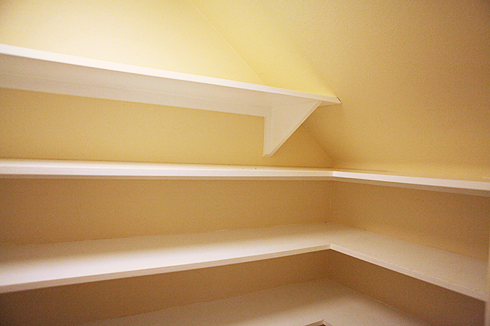
The shelves looking to the right inside the pantry.
Here is the long blank wall from the other side. The bulk head was 2 feet wide, so I thought it would be very easy to use cabinetry under it to sort of camouflage it. To do that, we would need to create a new walkway from the kitchen to the hall and from the kitchen to the dining room.
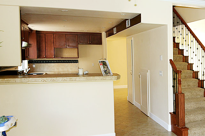
That is when we decided to also move the fridge from the far end - you can see the nook for it in the above picture, over to the middle of long wall. This would solve two problems: it would create that walkway - 36 inches of it, while enable us to close off those two feet under the bulk head and re-gain the corner of the pantry AND it would position the fridge more in the center of the kitchen, which would create a much more efficient work triangle (fridge, stove, sink).
Here is a floor plan to maybe better visualize this:
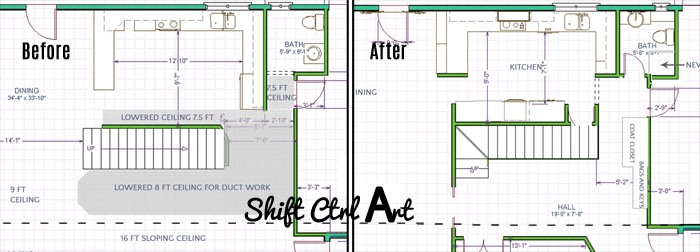
We shortened the peninsula at the other end of the kitchen as well to get a walkway into the dining room and create more symmetry in the layout. I'm a sucker for symmetry.
Here we are mid demo, the day the staircase got torn out and a new one built later that same day.
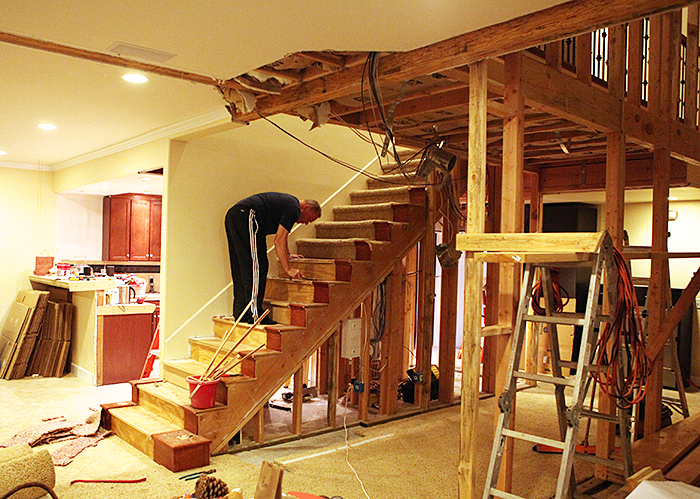
Let's open up the pantry to the rest of the house -said no one ever.
But here it is: the very open view of the pantry.
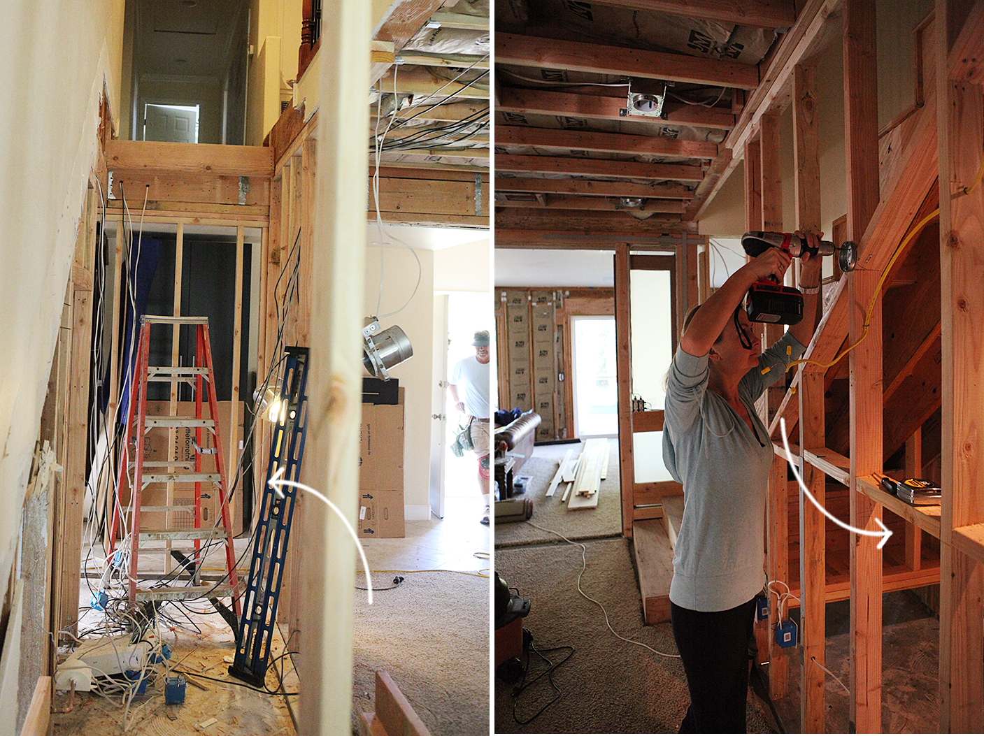
Looking in the other way under the stairs after they went in:
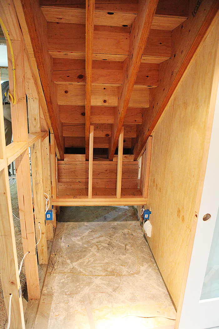
We opted not to close off the little nook under the stair turn. We use that spaceas our panic room to store moving boxes.
And from the side. Can you tell that the pantry is now much bigger?
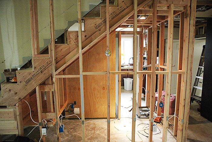
Not only did the pantry get bigger because we re-gained that corner, but we also pulled the door way out for even more room for shelves on the inside left wall.
Here, you can see how the entrance to the pantry has been pulled out and a pocket for the fridge has been created next to the pantry entrance. That pocket allows our standard sized fridge to sit almost flush with the wall of cabinets and look more like a counter depth fridge, but without the added cost or loss of fridge space.
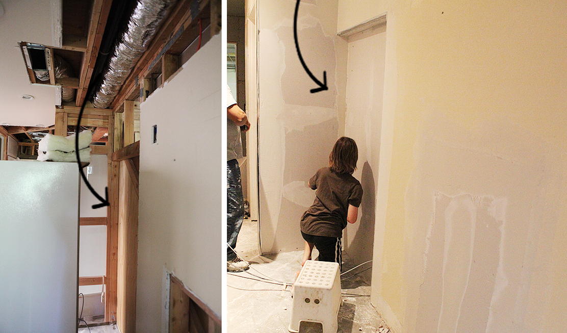
On the left while it was still only framed, and on the right after drywall had gone up and mudding was underway. B is helping out a bit.
As I mentioned in my staircase post, there was a point where we reached some remodeling fatigue and I didn't take that many pictures. Such as of the process of building the shelves inside the pantry and painting them.
What I do have, is this video clip, though, which I think you will love. Go get some popcorn. I'll wait.
If you are on a reader, you might have to click over to the post to play the video.
Golden palms at the next Cannes? No?
Then I have no progress pictures after that.
But, trust me, we had the shelves painted and moved everything in. If you close the door to the pantry it looks like this now - on the right.
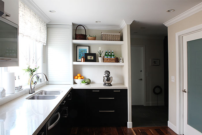
And inside? Oh ... inside...
Let's find out later this week in the reveal post.
I am taking pictures using this guy.
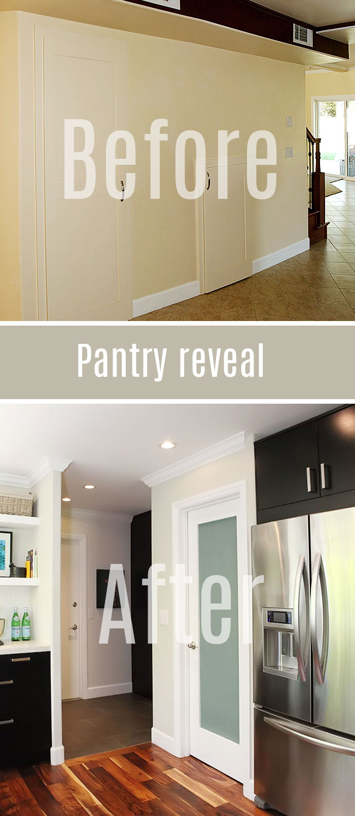
Next: The Pantry reveal - and 5 things your next pantry needs
Share

One of the things we wanted to fix was the appearance of the bulk head as well as this 45 degree corner going from the kitchen into the hall.

And the pantry was not maximizing the space available due to the angle cutting it off. Here is the closet inside. Not too bad, though.

6 good shelves in a walk in pantry. Very dreamy already. So much potential.

The shelves looking to the right inside the pantry.
Here is the long blank wall from the other side. The bulk head was 2 feet wide, so I thought it would be very easy to use cabinetry under it to sort of camouflage it. To do that, we would need to create a new walkway from the kitchen to the hall and from the kitchen to the dining room.

That is when we decided to also move the fridge from the far end - you can see the nook for it in the above picture, over to the middle of long wall. This would solve two problems: it would create that walkway - 36 inches of it, while enable us to close off those two feet under the bulk head and re-gain the corner of the pantry AND it would position the fridge more in the center of the kitchen, which would create a much more efficient work triangle (fridge, stove, sink).
Here is a floor plan to maybe better visualize this:

We shortened the peninsula at the other end of the kitchen as well to get a walkway into the dining room and create more symmetry in the layout. I'm a sucker for symmetry.
Here we are mid demo, the day the staircase got torn out and a new one built later that same day.

Let's open up the pantry to the rest of the house -said no one ever.
But here it is: the very open view of the pantry.

Looking in the other way under the stairs after they went in:

We opted not to close off the little nook under the stair turn. We use that space
And from the side. Can you tell that the pantry is now much bigger?

Not only did the pantry get bigger because we re-gained that corner, but we also pulled the door way out for even more room for shelves on the inside left wall.
Here, you can see how the entrance to the pantry has been pulled out and a pocket for the fridge has been created next to the pantry entrance. That pocket allows our standard sized fridge to sit almost flush with the wall of cabinets and look more like a counter depth fridge, but without the added cost or loss of fridge space.
On the left while it was still only framed, and on the right after drywall had gone up and mudding was underway. B is helping out a bit.

As I mentioned in my staircase post, there was a point where we reached some remodeling fatigue and I didn't take that many pictures. Such as of the process of building the shelves inside the pantry and painting them.
What I do have, is this video clip, though, which I think you will love. Go get some popcorn. I'll wait.
If you are on a reader, you might have to click over to the post to play the video.
Golden palms at the next Cannes? No?
Then I have no progress pictures after that.
But, trust me, we had the shelves painted and moved everything in. If you close the door to the pantry it looks like this now - on the right.

And inside? Oh ... inside...
Let's find out later this week in the reveal post.
I am taking pictures using this guy.
Next: The Pantry reveal - and 5 things your next pantry needs

About Katja Kromann
I am a Danish American decorating life in Seattle. I love all things design and DIY.
I can’t think of anything more fun than coming up with project, making it, photographing it and sharing it with you on my websites.
Since 2018 I have been making Ceramics, nearly full time.
AHomeForCeramics.com AHomeForDesign.com AHomeForCrafts.com AHomeForFood.com My Portfolio
