1st floor plan - before and after
When we were looking at houses, we had three things at the top of our list:
1. location, location, location
2. 9 ft ceilings in the living room - and a view to the back yard - not the street
3. A big back yard - which is pretty rare in my neighborhood.
Walls can always be changed, right? So we did.
The former owners had added on a new living and dining room downstairs, with a huge master suite upstairs. They had added 9 ft ceilings downstairs in the new addition (yay!).
The floor plan had created a need for compromises with the duct-work.
Here is the floor plan when we moved in:
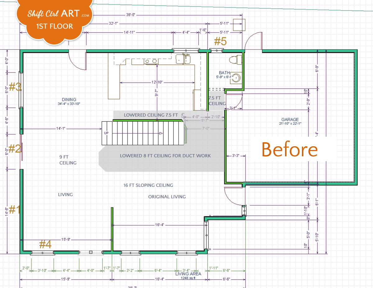
Click image for a larger view
As you can see, they had run into some challenges with the duct-work (The gray shaded area). Lots of different ceiling heights and most notably a heavy lowered ceiling next to the staircase that ended in an octagonal shape in the middle of the living room.
The stair case was extremely prominent with a reddish-orangy oak color and tons of black extruded aluminum railing with lots of "detail". The stair case also ran into the dining-room, making the room feel smaller. Further you could not turn on the light over the stairs, but had to jog down to the front door to turn on the lights.
In the kitchen the duct-work ran along an empty wall creating a bulkhead with nothing under it. This had been accented(!) with cabinet colored filler strips.
In the living room you may notice a short wall between the original and new living rooms. This wall was so short that the seating arrangement stuck out behind it by about half. It made the living room seem smaller and it made the original living room practically unusable. Something the previous residents had struggled with too, we could tell when touring the house.
The new living room did not have any windows to the back-yard, which was a shame because the back yard is nice and big (for our area in California)
So there were a few things that we wanted to fix.
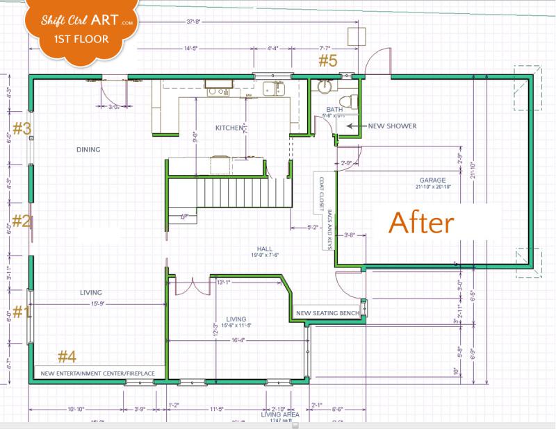
Here is the plan we came up with:
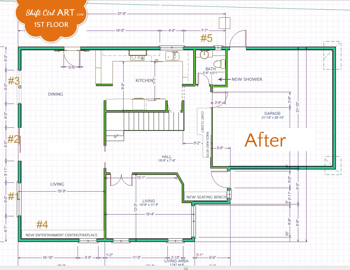
Click image for a larger view
Corresponding to the numbers on the drawings, we wanted to:
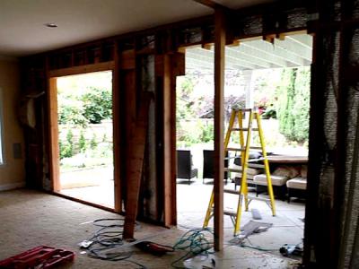
#1 - put in a floor to ceiling window to the back yard
#2 - add a taller slider to meet up with new floor to ceiling windows
#3 - same as #1
#4 - take out window to make room for fireplace and entertainment center
#5 - move the window in powder room to shift the vanity and make room for a new shower
Not numbered: Take out the stair case and move it back, turn the end of it to get it out of the living/dining room. (Add a light switch - it's the little things that count sometimes, right)
Put up walls around original living room to improve the floor plan and usability of the space. (Now this room gets used all the time when we have other kids over. Love this solution!)
Add more storage - the house had almost none. No coat closet for instance.
In the kitchen we wanted to fix the duct-work, move the fridge to the long empty wall and create a full wall of storage and get rid of the 45 degree angled wall at the same time.
These were the biggest part of our plans for the first floor.
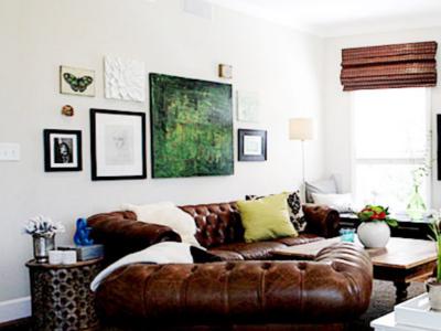
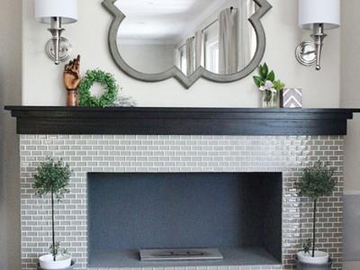
Here you can see the living room that we have shared so far, if you haven't already.
Living room remodel - the windows
Living room remodel - the entertainment center with fireplace
Living room remodel - the reveal
And here is our powder room remodel:
Powder room turned full bath - before and mood board
Powder room turned full bath - demo and remodeling
Powder room turned full bath - the reveal
And the Kitchen remodel:
The kitchen - and its many challenges - Part I
Demo in the Kitchen Part II - let the remodeling begin!
Kitchen plans - to get upper cabinets or not - and a mood board
Kitchen remodel: Putting in the new IKEA kitchen
Kitchen reveal: before and after pictures of our kitchen remodel - how it all came together - Part V
A kitchen with a view - the beginning - planning a new project
A kitchen with a view - we have a hedge!
Share
1. location, location, location
2. 9 ft ceilings in the living room - and a view to the back yard - not the street
3. A big back yard - which is pretty rare in my neighborhood.
Walls can always be changed, right? So we did.
The former owners had added on a new living and dining room downstairs, with a huge master suite upstairs. They had added 9 ft ceilings downstairs in the new addition (yay!).
The floor plan had created a need for compromises with the duct-work.
Here is the floor plan when we moved in:

Click image for a larger view
As you can see, they had run into some challenges with the duct-work (The gray shaded area). Lots of different ceiling heights and most notably a heavy lowered ceiling next to the staircase that ended in an octagonal shape in the middle of the living room.
The stair case was extremely prominent with a reddish-orangy oak color and tons of black extruded aluminum railing with lots of "detail". The stair case also ran into the dining-room, making the room feel smaller. Further you could not turn on the light over the stairs, but had to jog down to the front door to turn on the lights.
In the kitchen the duct-work ran along an empty wall creating a bulkhead with nothing under it. This had been accented(!) with cabinet colored filler strips.
In the living room you may notice a short wall between the original and new living rooms. This wall was so short that the seating arrangement stuck out behind it by about half. It made the living room seem smaller and it made the original living room practically unusable. Something the previous residents had struggled with too, we could tell when touring the house.
The new living room did not have any windows to the back-yard, which was a shame because the back yard is nice and big (for our area in California)
So there were a few things that we wanted to fix.
Here is the plan we came up with:

Click image for a larger view
Corresponding to the numbers on the drawings, we wanted to:
#1 - put in a floor to ceiling window to the back yard
#2 - add a taller slider to meet up with new floor to ceiling windows
#3 - same as #1
#4 - take out window to make room for fireplace and entertainment center
#5 - move the window in powder room to shift the vanity and make room for a new shower
Not numbered: Take out the stair case and move it back, turn the end of it to get it out of the living/dining room. (Add a light switch
Put up walls around original living room to improve the floor plan and usability of the space. (Now this room gets used all the time when we have other kids over. Love this solution!)
Add more storage - the house had almost none. No coat closet for instance.
In the kitchen we wanted to fix the duct-work, move the fridge to the long empty wall and create a full wall of storage and get rid of the 45 degree angled wall at the same time.
These were the biggest part of our plans for the first floor.
Here you can see the living room that we have shared so far, if you haven't already.
Living room remodel - the windows
Living room remodel - the entertainment center with fireplace
Living room remodel - the reveal
And here is our powder room remodel:
Powder room turned full bath - before and mood board
Powder room turned full bath - demo and remodeling
Powder room turned full bath - the reveal
And the Kitchen remodel:
The kitchen - and its many challenges - Part I
Demo in the Kitchen Part II - let the remodeling begin!
Kitchen plans - to get upper cabinets or not - and a mood board
Kitchen remodel: Putting in the new IKEA kitchen
Kitchen reveal: before and after pictures of our kitchen remodel - how it all came together - Part V
A kitchen with a view - the beginning - planning a new project
A kitchen with a view - we have a hedge!

About Katja Kromann
I am a Danish American decorating life in Seattle. I love all things design and DIY.
I can’t think of anything more fun than coming up with project, making it, photographing it and sharing it with you on my websites.
Since 2018 I have been making Ceramics, nearly full time.
AHomeForCeramics.com AHomeForDesign.com AHomeForCrafts.com AHomeForFood.com My Portfolio
