IKEA Kitchen reveal: before and after pictures of our kitchen remodel - how it all came together - Part V
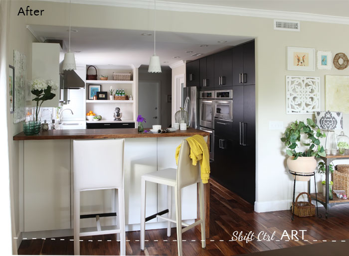
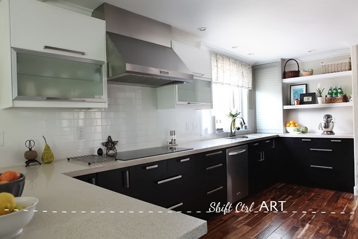
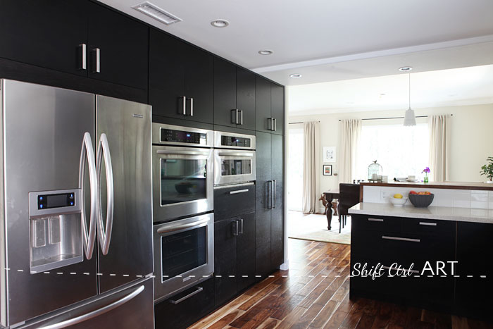
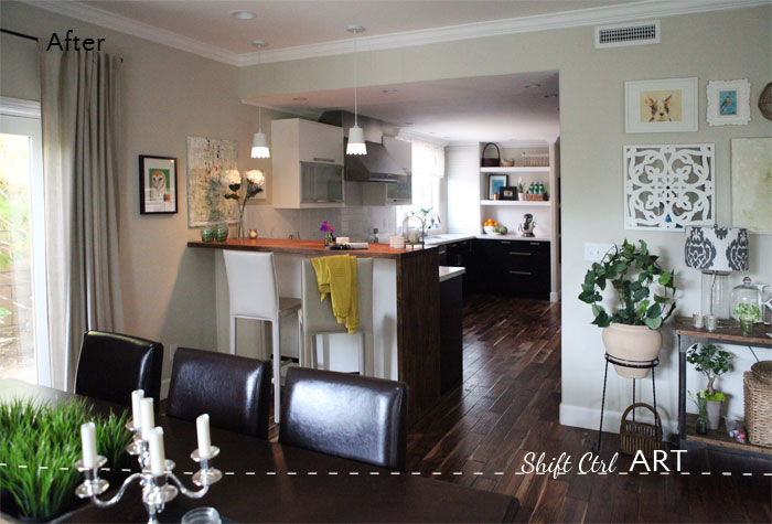
Here is our kitchen all remodeled with the new appliance wall on the right, new cabinets throughout and as you can see the bulk head for the vents is gone, the ceilings have been squared off and the kitchen layout is more symmetric with the fridge moved to the new appliance wall. I took all these "after" photos yesterday.
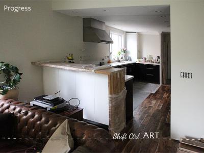
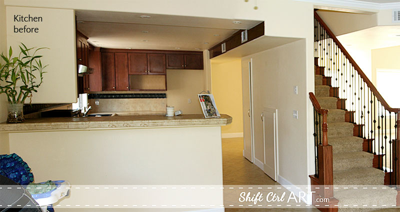
Here is what it looked like before as you might remember from this post.
And after - with the new wall of cabinets.
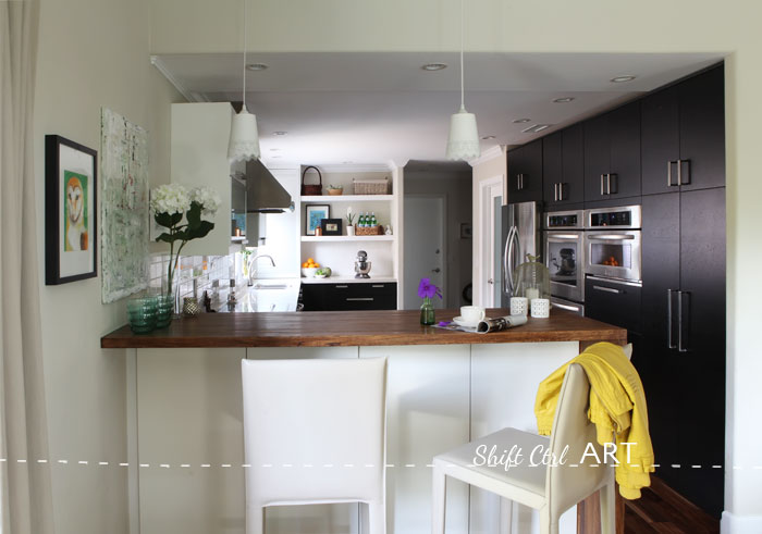
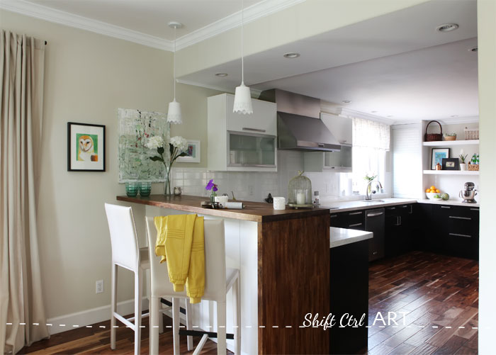
Our new bar has half depth cabinets under it with "push to open" springs and no handles to keep a clean lined look. Here I showed you the right side cabinets when I de-cluttered my horder-sized napkin and candle collection back in January.
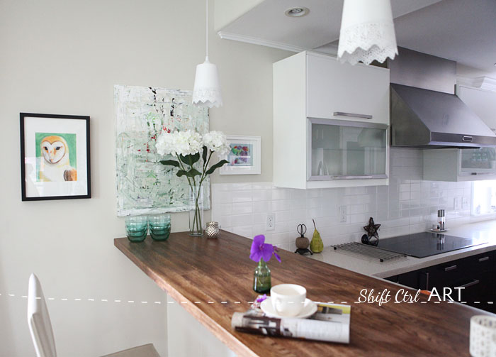
The bar top is made of the IKEA Numerär butcher block counters. I sanded and stained them to go with the floor.
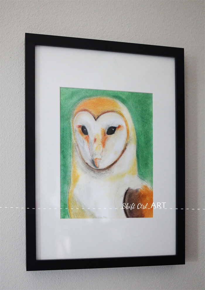
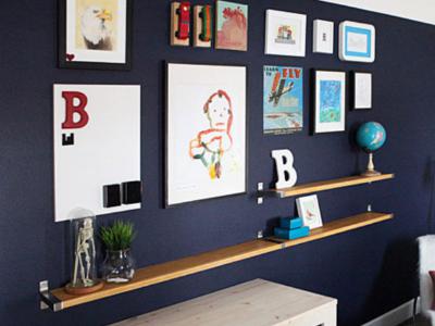
My son, B drew this in art class a couple of months ago.
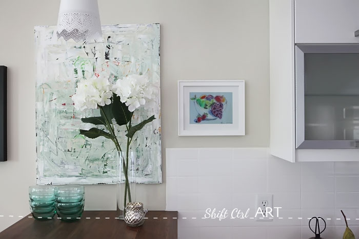
I made the abstract painting (canvas+Liquitex acrylic paint+painter's spatula). B drew the fruit bowl on the right. Its a color pencil drawing. You can see a close up of it here.
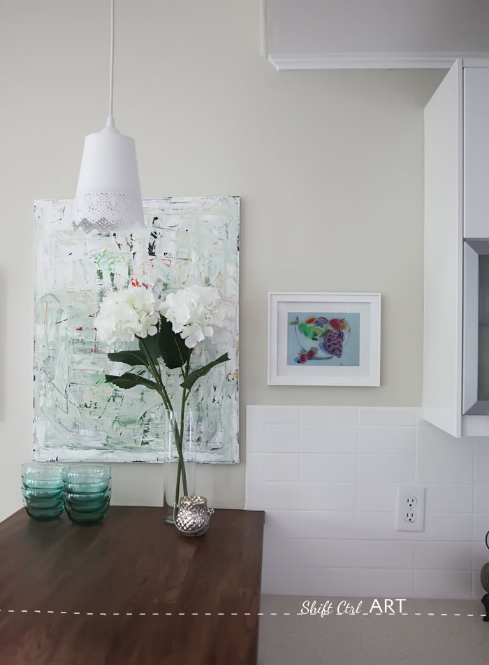
The lamps, we fashioned out of two SKURAR IKEA pots and two lamp kits from Lowe's. The kits are not on their website, but its the ones for their mini glass pendents. I think they were around 10 dollars each . Lamps for less than 15 bucks each. Yes please.
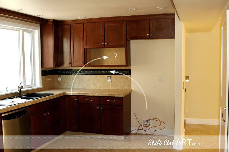
The back wall of the kitchen where the fridge used to be - before:
And after:
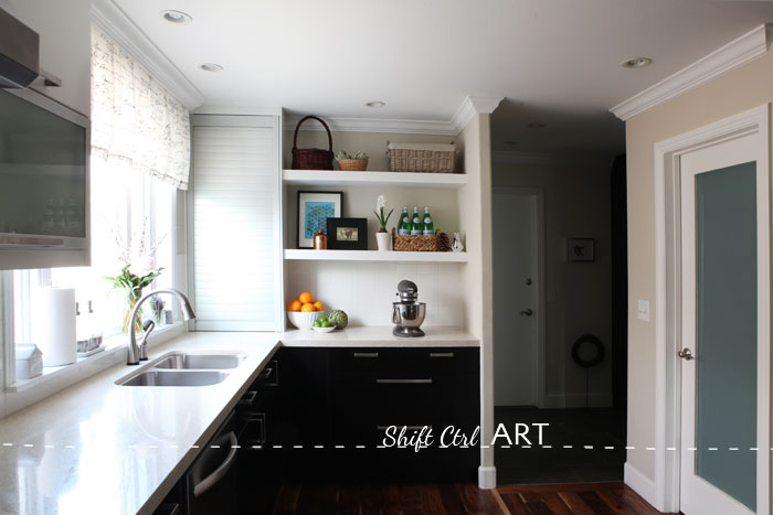
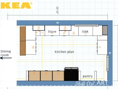
You can see that we shortened the kitchen wall with a new wing wall after moving the fridge and bumped out the wall on the right for the new pantry. That is the door to the new pantry on the right.
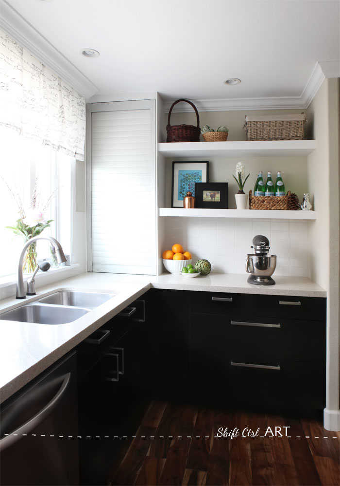
I sewed the curtain over the sink. When the crown went in, dh and I made a frame to be mounted for the crown to go around, leaving room for us to attach a strip of Velco. I sewed velcro on the curtain as well. That way the curtain can easily be taken down to be washed.
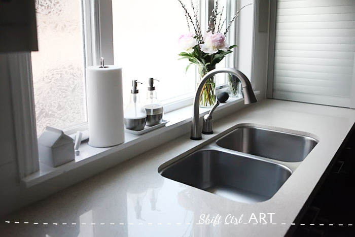
My new faucet, the Delta 2.0 touch. One of my favorite things in the kitchen.
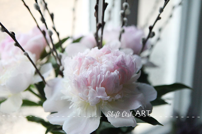
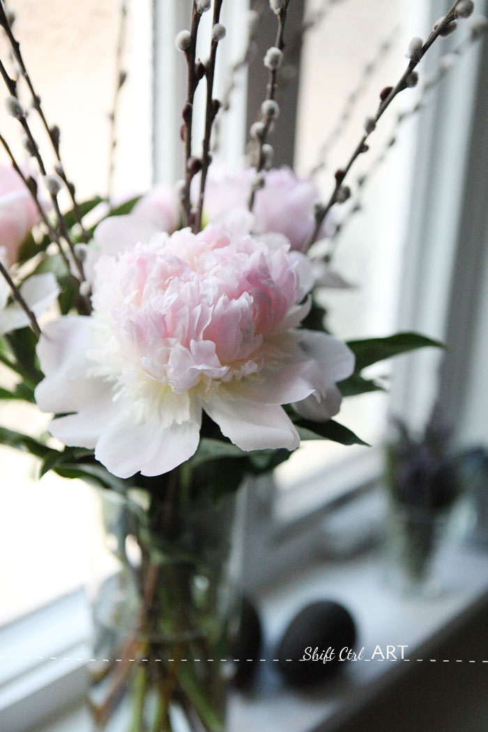
Flowers from Trader Joe's yesterday.
And looking back towards the dining room before.
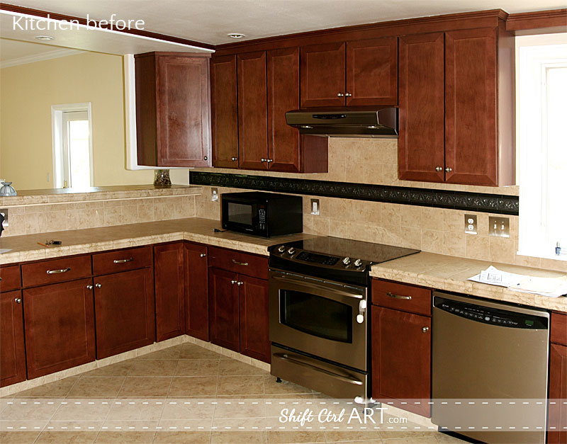
and after. No more awkward cabinet staring at you when you are hanging out at the breakfast bar.
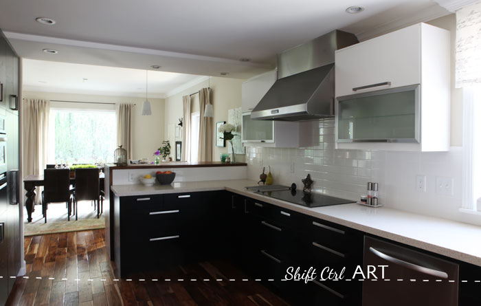
We used as many drawers as base cabinets as possible. Something I would definitely do again. We put LED lights inside the cabinets with the frosted doors. Here is a picture of the lights turned on.
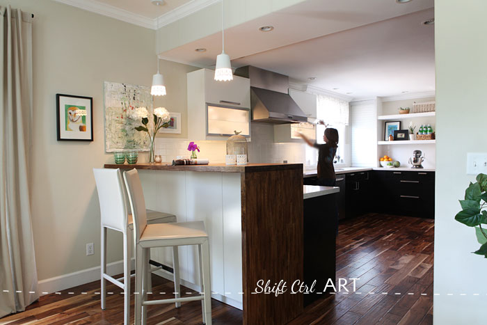
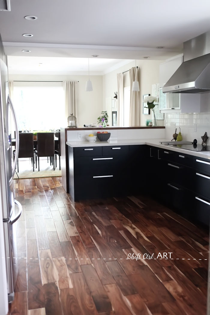
I think the pattern in the hard wood floors really help in making the kitchen a little more lively with all the other very square lines that are going on. I love that!
The blank wall before that became the appliance wall.
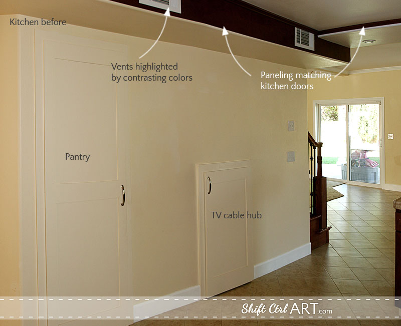
And after - no more bulk head. Yay! The vent now comes out of the ceiling.
Here are all the kitchen posts:
The kitchen and its many challenges - part I
Demo in the Kitchen Part II - let the remodeling begin! - with video
Kitchen plans - to get upper cabinets or not - and a mood board Part III
Kitchen remodel: Putting in the new IKEA kitchen - Part IV
Would I remodel a kitchen again? In a heartbeat! When can I begin? ha!
Sharing over at It's overflowing.
Sharing over at Suburbs Mama
Next: We started a new project in the kitchen. A kitchen with a view - the beginning - planning a new project
About Katja Kromann
I am a Danish American decorating life in Seattle. I love all things design and DIY.
I can’t think of anything more fun than coming up with project, making it, photographing it and sharing it with you on my websites.
I am a Graphic Artist, a remodeller and home maker by day.
AHomeForDesign.com AHomeForCrafts.com AHomeForFood.com My Portfolio
Categories
IKEA Kitchen reveal: before and after pictures of our kitchen remodel - how it all came together - Part V is posted in the category Before & After | Kitchen
